Python从门到精通(九):matploblib图形库
2023-12-14 21:40:23
Matplotlib 是一个数字绘图库,可以绘制多种图形

绘制图形
曲线图
import matplotlib.pyplot as plt

class PltDemo:

    def __init__(self) -> None:
        # 数据
        self.squares = [1, 4, 9, 16, 25]

    def init_ax(self):
        # flg:由生成的一系列绘图构建成的整体个图形
        # ax:表示图形中的绘图,使用这个变量来定义和绘制图形
        fig, ax = plt.subplots()
        return ax

    def ax_setting(self, ax):
         # 绘图,plot可以多次调用,添加多个图形
        ax.plot(self.squares)

    def showGraphy(self):
        plt.show()


if __name__ == "__main__":
    pltDemo = PltDemo()
    ax = pltDemo.init_ax()
    pltDemo.ax_setting(ax)
    pltDemo.showGraphy()

整合np
显示sin区线
import numpy as np
import matplotlib.pyplot as plt

# 生成数据
x = np.arange(0, 6, 0.1) # 以0.1为单位,生成0到6的数据
y = np.sin(x)

# 绘制图形
plt.plot(x, y)
plt.show()
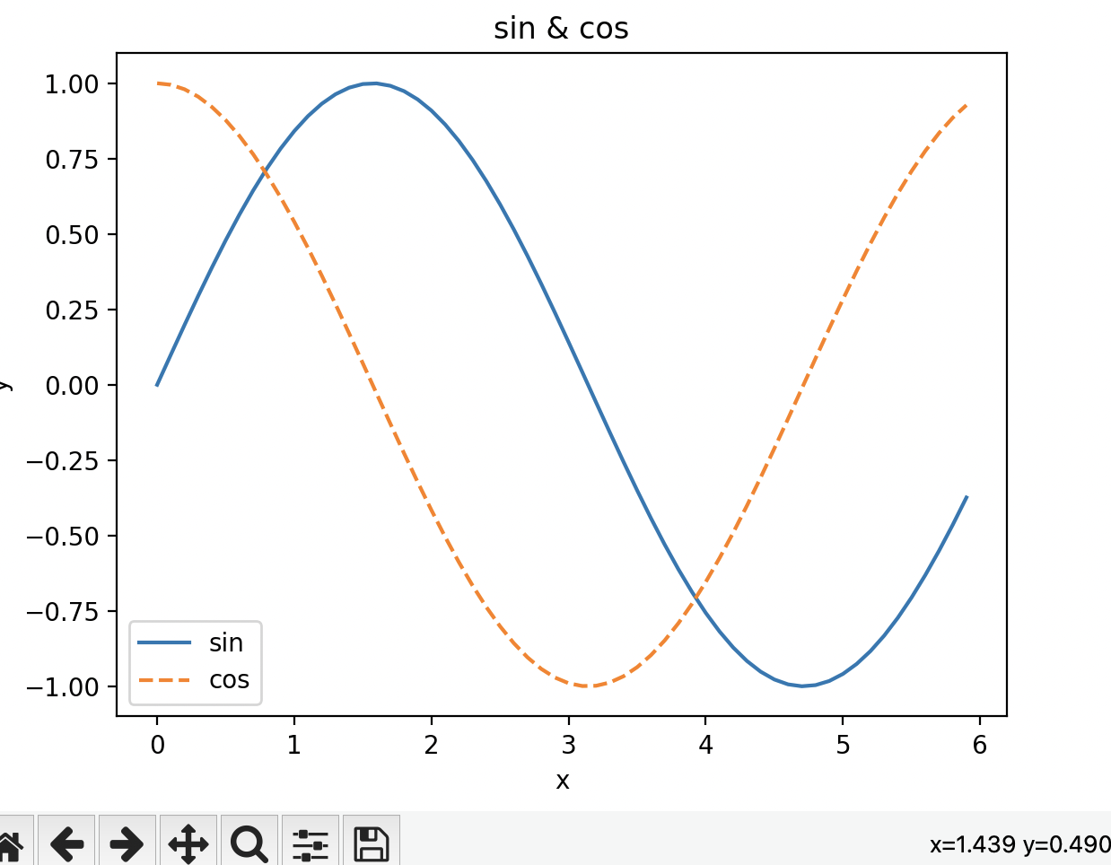
添加多个图形
# coding: utf-8
import numpy as np
import matplotlib.pyplot as plt

# 生成数据
x = np.arange(0, 6, 0.1) # 以0.1为单位,生成0到6的数据
y1 = np.sin(x)
y2 = np.cos(x)

# 绘制图形
plt.plot(x, y1, label="sin")
plt.plot(x, y2, linestyle = "--", label="cos")
plt.xlabel("x") # x轴的标签
plt.ylabel("y") # y轴的标签
plt.title('sin & cos')
plt.legend()
plt.show()
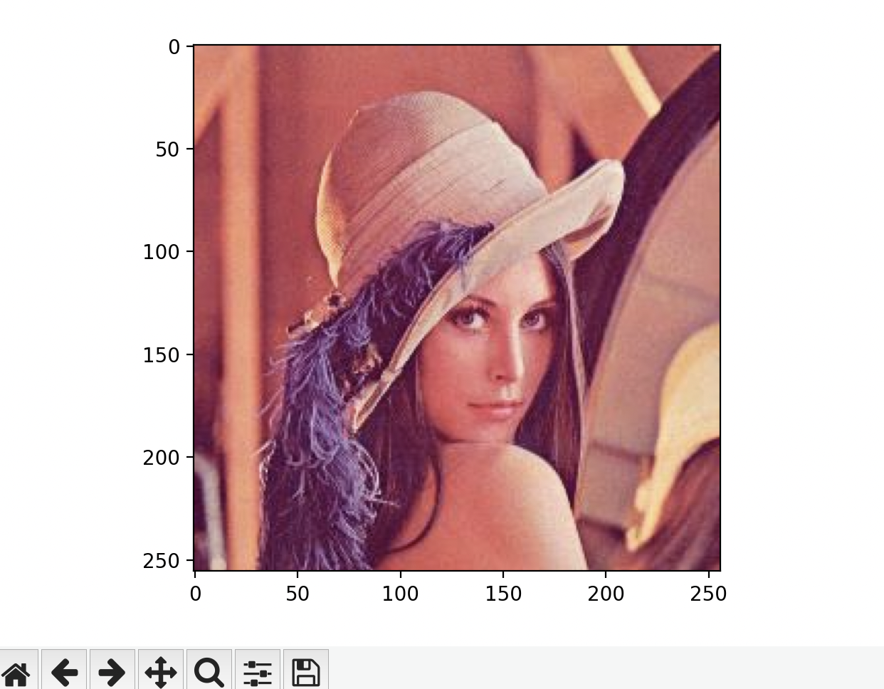
读取图像
本地读取
import matplotlib.pyplot as plt
from matplotlib.image import imread

img = imread('../dataset/lena.png') #读入图像
plt.imshow(img)

plt.show()
设置样式
个性化样式
 def ax_setting(self, ax):
         # 绘图
        ax.set_title("title", fontsize=24)
        ax.set_xlabel("xlabe", fontsize=14)
        ax.set_ylabel("ylabel", fontsize=14)
        ax.tick_params(labelsize=14) # 刻度样式
        ax.ticklabel_format(style='plain')

        # 设置初始值
        ax.plot(self.input_value, self.squares, linewidth=3) #图形的线条粗细
内置样式
    def init_ax(self):
        print(plt.style.available)
        plt.style.use('seaborn')
        fig, ax = plt.subplots()
        return ax
设置散列点
        ax.scatter(2, 4, s=200) #设置某个点的大小
        ax.scatter(self.input_value, self.squares, s=100)
        ax.scatter(self.input_value, self.squares,color='red', s=100)
设置坐标范围
# 设置每个坐标轴的取值范围,x=0~100, y=0~1
ax.axis([0, 50, 0, 50])
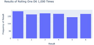
使用plotly.express在浏览器中显示图形
Plotly Express是Matplotlib的一个子集
import plotly.express as px

poss_results = range(1, 7)
frequencies = [185, 164, 171, 168, 145, 167]
title = "Results of Rolling One D6 1,000 Times"
labels = {'x': 'Result', 'y': 'Frequency of Result'}
fig = px.bar(x=poss_results, y=frequencies, title=title, labels=labels)
fig.show()
文章来源:https://blog.csdn.net/liudonglovehemin/article/details/134929638
本文来自互联网用户投稿,该文观点仅代表作者本人,不代表本站立场。本站仅提供信息存储空间服务,不拥有所有权,不承担相关法律责任。 如若内容造成侵权/违法违规/事实不符,请联系我的编程经验分享网邮箱:veading@qq.com进行投诉反馈,一经查实,立即删除!
本文来自互联网用户投稿,该文观点仅代表作者本人,不代表本站立场。本站仅提供信息存储空间服务,不拥有所有权,不承担相关法律责任。 如若内容造成侵权/违法违规/事实不符,请联系我的编程经验分享网邮箱:veading@qq.com进行投诉反馈,一经查实,立即删除!