CSS动画知识点
2023-12-26 20:02:55
前言
对动画的知识点较为薄弱,通过以下知识点的记录来加深印象
一、@keyframes
@keyframes 规则是创建动画。
@keyframes 规则内指定一个 CSS 样式和动画将逐步从目前的样式更改为新的样式。
注意:?您必须定义动画的名称和动画的持续时间(如?animation: frame 5s;)。如果省略的持续时间,动画将无法运行,因为默认值是0。
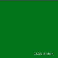
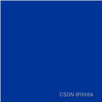
?图片颜色由绿色逐渐为蓝色?
<div class="example"></div>.example {
width: 200px;
height: 200px;
animation: frame 5s; //绑定动画名称 动画时间
animation-iteration-count: infinite; //无限次播放
}
/* from-to,等同于0%-100% ; */
@keyframes frame {
from {
background-color: green;
}
to {
background-color: blue;
}
}
/*使用这个动画名称的话,盒子会从宽高为200px的盒子变为宽高为300px*/
@keyframes data {
0% {
background-color: red;
}
100% {
background-color: green;
width: 300px;
height: 300px;
}
}二、animation(实现自定义动画)
简写:animation: name duration timing-function delay iteration-count direction fill-mode play-state;
| 属性 | 说明 |
| animation-name | 动画名称 |
| animation-duration? | 动画持续时间(动画需要多少秒/毫秒完成) |
| animation-timing-function | 定义动画以怎么样的速度曲线完成一个周期 |
| animation-delay | 规定动画启动之前的延迟 |
| animation-iteration-count | 动画的播放次数 |
| animation-derection | 动画是否应该轮流反向播放 |
| animation-fill-mode | 规定元素在不播放动画时的样式(在开始前、结束后,或两者同时)。 |
| animation-play-state | 规定动画是否正在运行/暂停 |
.example {
    width: 200px;
    height: 200px;
    animation: frame 5s linear 4s infinite reverse; /* 绑定动画名称 动画时间 动画匀速变化 动画开始前等待的时间 动画的播放次数 动画是否循环交替反向播放动画 */
    animation-name: frame; /* 动画名称 */
    animation-duration: 5s; /* 动画在多少秒/毫秒内完成 */
    animation-timing-function: linear; /*  动画速度变化 匀速 */
    animation-delay: 4s; /*  动画在4s后开始 */
    animation-iteration-count: infinite; /* 无限次播放 动画的播放次数 */
    animation-direction: reverse; /* 动画的播放方式 反向播放 */
    /*  animation-fill-mode: none; 播放完采用默认形式 */
    /*  animation-play-state:paused; 暂停动画 */
}

@keyframes frame {
    from {
        background-color: green;
    }
    to {
        background-color: blue;
    }
}
三、transition(实现渐变动画)
简写:transition:?property?duration timing-function delay;
| 值 | 描述 |
| transition-property | CSS属性,如width,heigtht |
| transition-duration | transition效果需要多少s/ms完成 |
| transition-timing-function | transition效果的速度曲线(匀速等) |
| transition-delay | transition效果开始前延误的时间 |
 从一个宽为200px的元素在5s后变为宽为500px的元素
.example {
    width: 200px;
    height: 200px;
    background-color: #f5222d;
    transition: width 5s;
    &:hover {
        width: 500px;
    }
}
四、transform(转变动画)
| 值 | 描述 |
| translate | 移动 |
| scale | 缩放 |
| rotate | 旋转 |
| skew | 倾斜 |
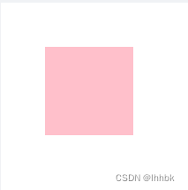
.example {
    width: 200px;
    height: 200px;
    background-color: pink;
    /* transform: translate(300px, 300px); */
    /* transform: rotate(45deg); 旋转45度 */
    transform: scale(0.5); //放大1.5
}
文章来源:https://blog.csdn.net/Tonghanhan/article/details/135217970
本文来自互联网用户投稿,该文观点仅代表作者本人,不代表本站立场。本站仅提供信息存储空间服务,不拥有所有权,不承担相关法律责任。 如若内容造成侵权/违法违规/事实不符,请联系我的编程经验分享网邮箱:veading@qq.com进行投诉反馈,一经查实,立即删除!
本文来自互联网用户投稿,该文观点仅代表作者本人,不代表本站立场。本站仅提供信息存储空间服务,不拥有所有权,不承担相关法律责任。 如若内容造成侵权/违法违规/事实不符,请联系我的编程经验分享网邮箱:veading@qq.com进行投诉反馈,一经查实,立即删除!