HTML5+CSS3小实例:萤火虫动画效果
2023-12-16 09:31:03
目录
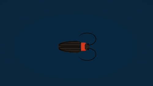
?一、运行效果
GIF效果
二、项目概述
????????本项目是一个基于HTML和CSS的网页动画效果,展示了一个萤火虫的动画效果。通过使用CSS样式和动画属性,实现了萤火虫身体的闪烁、翅膀的摆动等效果。
三、开发环境
开发环境:VsCode
编程语言:Html+css
操作系统:Windows
四、实现步骤及代码
1.创建空文件夹
<!DOCTYPE html>
<html lang="en">

<head>
  <meta charset="UTF-8">
  <meta http-equiv="X-UA-Compatible" content="IE=edge">
  <meta name="viewport" content="width=device-width, initial-scale=1.0">
  <title>公众号《编程乐学》- 萤火虫动画效果</title>

</head>

<body>

</body>

</html>
2.完成页面内容
 <div class="checkbox-wrap">
    <input class="checkbox" id="checkbox" type="checkbox" />
    <label class="firefly" for="checkbox">
      <div class="abdomen">
        <div class="thorax">
          <div class="head">
            <div class="eyes"></div>
            <div class="antennae"></div>
          </div>
        </div>
        <div class="wings">
          <div class="wing wing-a"></div>
          <div class="wing wing-b"></div>
        </div>
      </div>
    </label>
  </div>
3.完成css样式
????????这段代码是一个萤火虫动画效果的HTML和CSS代码片段。它使用CSS来实现动画效果和响应式设计。代码中包含了萤火虫的身体、眼睛、触角和翅膀等部分的样式定义。通过使用伪类和动画效果,实现了萤火虫身体的闪烁、翅膀的旋转等动画效果。整个动画效果非常生动有趣。
????????在代码中,使用了flex布局来使元素垂直居中,并设置了背景渐变和字体样式。使用了伪类和绝对定位来定义了萤火虫的各个部分的样式,例如头部、眼睛、触角、胸部和腹部等。使用了过渡效果和动画效果来实现了萤火虫的闪烁和翅膀的动画效果。
 <style>
    body {
      display: flex;
      align-items: center;
      justify-content: center;
      flex-direction: column;
      height: 100vh;
      background: radial-gradient(#0a2a43 30%, #09243a);
      font-family: 'Asap', sans-serif;
    }

    body:after {
      content: '';
      display: block;
      position: absolute;
      top: 1rem;
      right: 1rem;
      bottom: 1rem;
      left: 1rem;
      border: 4px solid #071c2d;
      border-radius: 2px;
      background: none;
      pointer-events: none;
    }

    .label {
      flex: 0;
      color: #b8c5d0;
      letter-spacing: .04em;
      text-align: center;
      margin-bottom: 2rem;
      font-size: 3rem;
    }

    @media screen and (min-width: 60rem) {
      .label {
        font-size: 5vw;
      }
    }

    .checkbox-wrap {
      flex: none;
      position: relative;
      width: 10%;
      min-width: 8rem;
      z-index: 1;
    }

    .checkbox-wrap:after {
      content: '';
      display: block;
      padding-top: 50%;
    }

    .checkbox {
      display: none;
    }

    .checkbox:checked~.firefly .abdomen {
      background: #27231e;
      box-shadow: inset 0 0 1.5rem rgba(150, 0, 0, 0.75);
      animation: flicker 4000ms ease infinite;
    }

    .checkbox:checked~.firefly .wing-a {
      transform: rotate(30deg);
    }

    .checkbox:checked~.firefly .wing-b {
      transform: rotate(-30deg);
    }

    .head {
      position: absolute;
      top: 15%;
      left: 60%;
      bottom: 15%;
      background: #27231e;
      width: 70%;
      border-radius: 40% 80% 80% 40%;
      box-shadow: inset -0.1rem 0 0 0.3rem rgba(14, 10, 10, 0.2);
    }

    .eyes {
      position: absolute;
      top: -5%;
      right: 10%;
      bottom: -5%;
      width: 35%;
    }

    .eyes:before,
    .eyes:after {
      content: '';
      display: block;
      position: absolute;
      right: 0;
      width: 100%;
      box-sizing: border-box;
      border-radius: 100%;
      background: #0e0a0a;
      padding-top: 100%;
    }

    .eyes:before {
      top: 0;
    }

    .eyes:after {
      bottom: 0;
    }

    .antennae {
      position: absolute;
      top: 20%;
      left: -150%;
      bottom: 20%;
      width: 400%;
      z-index: -1;
    }

    .antennae:before,
    .antennae:after {
      content: '';
      display: block;
      position: absolute;
      right: 0;
      width: 100%;
      box-sizing: border-box;
      border-color: #0e0a0a;
      border-style: solid;
      padding-top: 65%;
      border-width: .25rem .25rem .25rem 0;
    }

    .antennae:before {
      top: 80%;
      border-radius: 0 100% 100% 100%;
    }

    .antennae:after {
      bottom: 80%;
      border-radius: 100% 100% 100% 0;
    }

    .thorax {
      position: absolute;
      top: 0;
      left: 100%;
      bottom: 0;
      background: #d43b1f;
      width: 30%;
      border-radius: 20% 80% 80% 20%;
      box-shadow: inset -0.1rem 0 0.1rem 0.3rem rgba(0, 0, 0, 0.2);
    }

    .abdomen {
      position: absolute;
      top: 10%;
      right: 20%;
      bottom: 10%;
      background: #27231e;
      width: 100%;
      transition: all 1000ms ease;
      border-radius: 100% 30% 30% 100%;
      box-sizing: border-box;
    }

    .abdomen:after {
      content: '';
      display: block;
      position: absolute;
      top: 0;
      right: 0;
      bottom: 0;
      left: 0;
      z-index: 0;
      box-shadow: inset -1rem 0 0.2rem 0.3rem rgba(0, 0, 0, 0.1);
    }

    .wings {
      position: absolute;
      top: -20%;
      right: 0;
      bottom: -20%;
      left: -5%;
      z-index: 1;
    }

    .wings .wing {
      position: absolute;
      right: 0;
      box-sizing: border-box;
      box-shadow: inset 0.2rem 0 0.1rem 0.5rem rgba(0, 0, 0, 0.5);
    }

    .wings .wing.wing-a {
      transform-origin: bottom right;
      top: 0;
      border-radius: 90% 30% 0 20%;
    }

    .wings .wing.wing-b {
      transform-origin: top right;
      top: 50%;
      border-radius: 20% 0 30% 90%;
    }
  </style>
五、项目总结? ?
????????本项目通过HTML和CSS实现了一个萤火虫动画效果,通过使用CSS的动画属性和关键帧动画,使萤火虫身体闪烁、翅膀摆动,增加了页面的趣味性和动感。页面采用了Flexbox布局和响应式设计,确保在不同设备上都能良好地展示。背景采用暗色调的径向渐变,营造出夜晚的氛围。整个项目的实现过程中,充分发挥了CSS的动画和布局特性,展示了CSS在创建动态效果和响应式页面方面的能力。
六、源码获取
?????????还可以关注宫纵号《编程乐学》,菜单栏有很多优质的开源项目以及更多的编程资料等你来学习。
文章来源:https://blog.csdn.net/qq_29823791/article/details/135026994
本文来自互联网用户投稿,该文观点仅代表作者本人,不代表本站立场。本站仅提供信息存储空间服务,不拥有所有权,不承担相关法律责任。 如若内容造成侵权/违法违规/事实不符,请联系我的编程经验分享网邮箱:veading@qq.com进行投诉反馈,一经查实,立即删除!
本文来自互联网用户投稿,该文观点仅代表作者本人,不代表本站立场。本站仅提供信息存储空间服务,不拥有所有权,不承担相关法律责任。 如若内容造成侵权/违法违规/事实不符,请联系我的编程经验分享网邮箱:veading@qq.com进行投诉反馈,一经查实,立即删除!