鸿蒙Harmony(五)ArkUI---基础组件:Text、TextInput、Button、Slider
2023-12-27 14:40:21
Text组件
1.设置文案
Text(content?:string|Resource)
// string格式
Text('Hello world')
// resource资源格式,读取本地资源
 Text($r('app.string.hello'))
在资源文件中添加对应的文本资源
{
“name”: “hello”,
“value”: “hello world”
}
2.属性设置
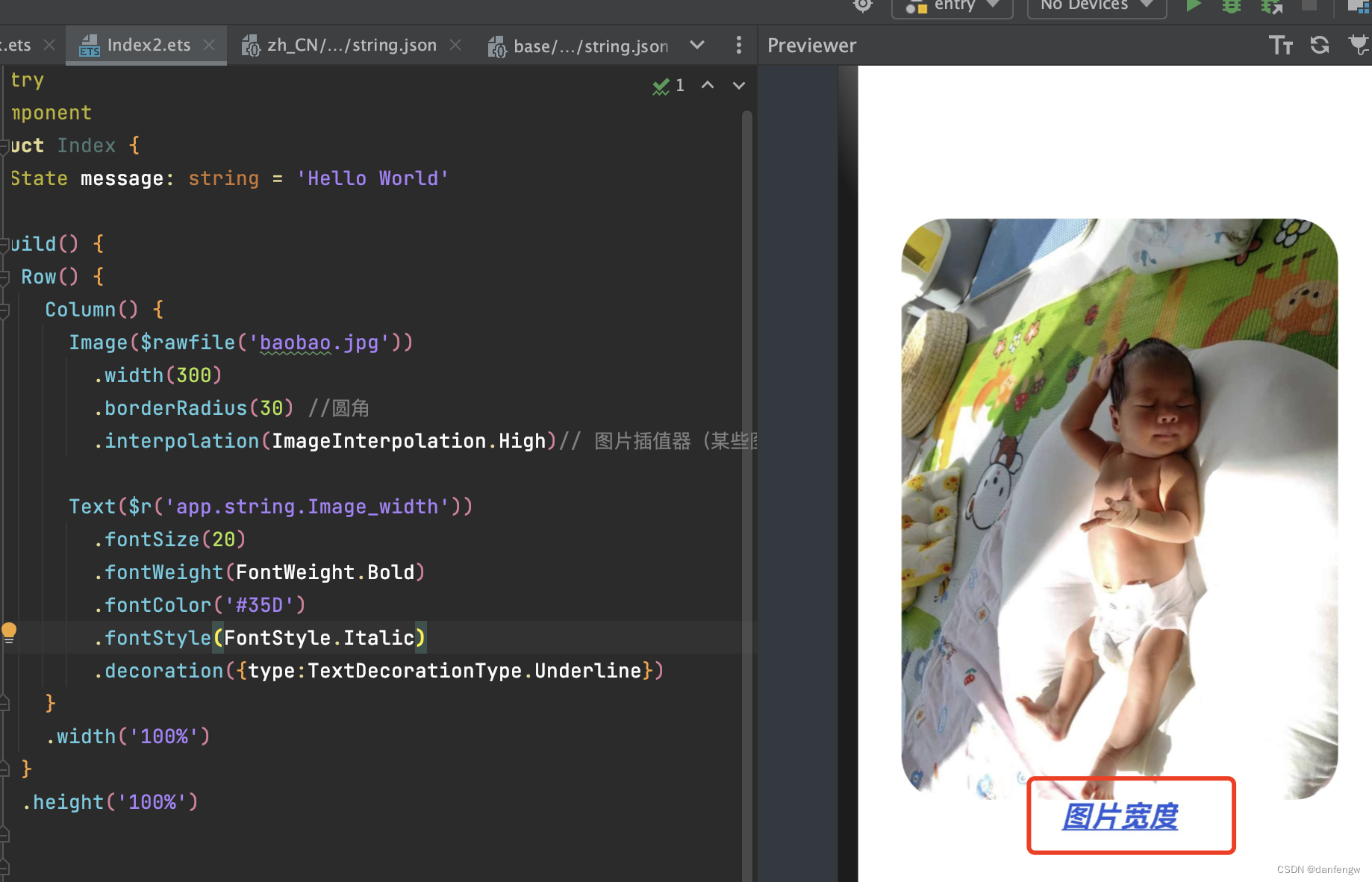
  Text($r('app.string.Image_width'))
          .fontSize(20)
          .fontWeight(FontWeight.Bold)
          .fontColor('#35D')
          .fontStyle(FontStyle.Italic)
          .decoration({type:TextDecorationType.Underline})
效果
TextInput组件
1.声明TextInput组件
TextInput({placeholder?:ResourceStr,text?:ResourceStr})
placeholder:输入框无输入时的提示文本
text:输入框当前的文本内容
2.添加属性和事件
      TextInput({ placeholder: '请输入图片宽度' })
            .type(InputType.Number) // 输入框类型
            .placeholderColor('#eeeeee')
            .backgroundColor('#f00')
            .fontColor('#35D')
            .fontSize(20)
            .onChange((value:String)=>{
              console.log("打印"+value)
            })
Button组
Button(options?: {type?: ButtonType, stateEffect?: boolean})
Button(label?: ResourceStr, options?: { type?: ButtonType, stateEffect?: boolean })
type用于定义按钮样式,示例代码中ButtonType.Capsule表示胶囊形按钮;stateEffect用于设置按钮按下时是否开启切换效果,当状态置为false时,点击效果关闭,默认值为true。

Button("缩小", { type: ButtonType.Capsule, stateEffect: true })
            .fontSize(20)
            .onClick((event) => {
              if (this.imageWidth > 150) {
                this.imageWidth--
              }
            })
          Button("放大", { type: ButtonType.Capsule, stateEffect: true })
            .fontSize(20)
            .onClick((event) => {
              if (this.imageWidth < 300) {
                this.imageWidth++
              }
            })
            // button包裹子组件,含有图片的按钮
          Button({ type: ButtonType.Circle, stateEffect: true }) {
            Image($r('app.media.icon')).width(30).height(30)
          }

Slider组件
Slider(options?: {value?: number, min?: number, max?: number, step?: number, style?: SliderStyle, direction?: Axis, reverse?: boolean})
 Slider({
          min: 150,
          max: 300,
          value: this.imageWidth,
          step: 10,
          direction: Axis.Horizontal,
          style: SliderStyle.OutSet,

        })
          .blockColor("#38D") // 滑块颜色
          .trackColor("#35D") // 进度条颜色
          .showTips(true) // 是否显示提示
          .trackThickness(5)
          .onChange((value, mode) => {
            this.imageWidth = value
          })
文章来源:https://blog.csdn.net/danfengw/article/details/135197304
本文来自互联网用户投稿,该文观点仅代表作者本人,不代表本站立场。本站仅提供信息存储空间服务,不拥有所有权,不承担相关法律责任。 如若内容造成侵权/违法违规/事实不符,请联系我的编程经验分享网邮箱:veading@qq.com进行投诉反馈,一经查实,立即删除!
本文来自互联网用户投稿,该文观点仅代表作者本人,不代表本站立场。本站仅提供信息存储空间服务,不拥有所有权,不承担相关法律责任。 如若内容造成侵权/违法违规/事实不符,请联系我的编程经验分享网邮箱:veading@qq.com进行投诉反馈,一经查实,立即删除!