CSS篇之圆角梯形
2023-12-14 05:04:59
附上一篇文章:梯形tab按钮-基于clip-path path函数实现 - JSRUN.NET
他这个区别在于,收尾两侧都是直角的,如图
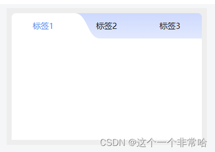
下面这个是圆角:

思路:
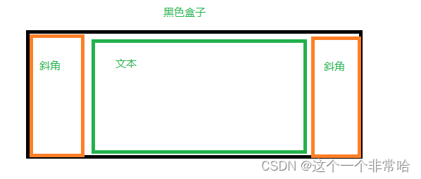
代码如下:
<template>
  <div class="wrap">
    <div class="tabs">
      <div v-for="index in 3" :key="index" class="box">
        <div class="tab" :class="{ active: activeIndex == index }" @click="onTabClick(index)">
          {{ '标签' + index }}
        </div>
      </div>
    </div>
    <div class="content-wrap"></div>
  </div>
</template>
<script>
export default {
  data() {
    return {
      activeIndex: -1,
      tabList: [
        { id: 1, label: '数据真短' },
        { id: 21, label: '数据报告' },
        { id: 31, label: '数据展示' }
      ]
    };
  },
  methods: {
    onTabClick(val) {
      this.activeIndex = val;
    }
  }
};
</script>

<style lang="scss">
.wrap {
  background-color: #eee;
  width: 620px;
  margin: 0 auto;
  padding: 10px;
  box-sizing: border-box;
}

.tabs {
  display: flex;
  width: 100%;
  overflow: hidden;
  border-radius: 8px 8px 0 0;
  background: linear-gradient(#cdd9fe, #e2e9fd);
  .box {
    width: 200px;
    height: 50px;
  }
}

.tab {
  width: 100px;
  height: 50px;
  margin: 0 auto;
  cursor: pointer;
  position: relative;
  text-align: center;
  line-height: 50px;
}

.tab.active {
  background-color: #fff;
  color: #4185ef;
}

.tab.active:before {
  content: '';
  position: absolute;
  top: 0;
  left: -50px;
  height: 100%;
  width: 50px;
  z-index: 2;
  background-color: #fff;
  clip-path: path('M 50,0 C 25,0 25,50 0,50 L 50,50 Z');
}

.tab.active:after {
  content: '';
  position: absolute;
  top: 0;
  right: -50px;
  height: 100%;
  width: 50px;
  z-index: 2;
  background-color: #fff;
  clip-path: path('M 0,0 C 25,0 25,50 50,50 L 0, 50 Z');
}

.content-wrap {
  min-height: 200px;
  background-color: #fff;
}
</style>
最后:附上一个CSS实现的另一种方法
文章来源:https://blog.csdn.net/ae_pppppp/article/details/134967558
本文来自互联网用户投稿,该文观点仅代表作者本人,不代表本站立场。本站仅提供信息存储空间服务,不拥有所有权,不承担相关法律责任。 如若内容造成侵权/违法违规/事实不符,请联系我的编程经验分享网邮箱:veading@qq.com进行投诉反馈,一经查实,立即删除!
本文来自互联网用户投稿,该文观点仅代表作者本人,不代表本站立场。本站仅提供信息存储空间服务,不拥有所有权,不承担相关法律责任。 如若内容造成侵权/违法违规/事实不符,请联系我的编程经验分享网邮箱:veading@qq.com进行投诉反馈,一经查实,立即删除!