【QML-容器】
Qt编程指南-VX:hao541022348
■ 容器
可以用容器把这个一组控件给包起来,大部分的容器都是不提供布局功能的,我们需要自己手动去布局.
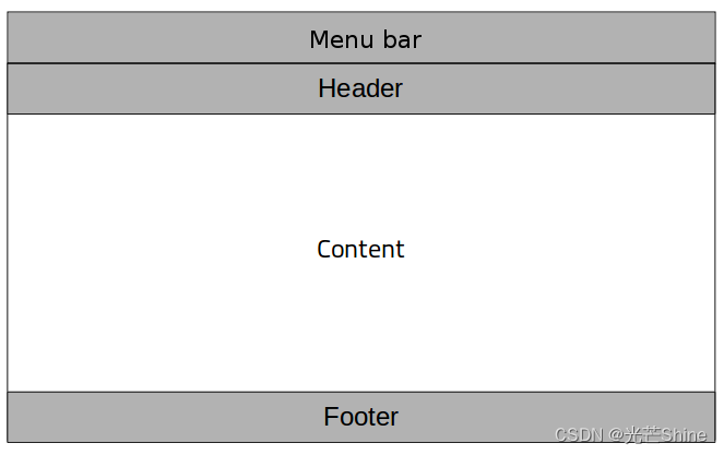
■ ApplicationWindow 🏆
ApplicationWindow 是一个可以方便地向窗口中添加 菜单栏、页眉和 页脚项 的窗口。很像经常使用的界面窗口。这个类似 Window的基础窗口。
可以当顶层窗口使用
我们可以将ApplicationWindow声明为应用程序的根元素,并使用QQmlApplicationEngine来运行它。
  import QtQuick.Controls 2.12
  ApplicationWindow {
      visible: true

      menuBar: MenuBar {
          // ...
      }

      header: ToolBar {
          // ...
      }

      footer: TabBar {
          // ...
      }

      StackView {
          anchors.fill: parent
      }
  }
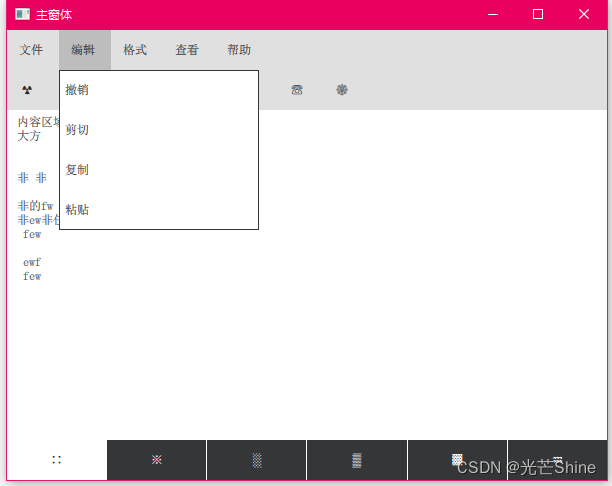
示例二
使用也是很简单的,其实就利用上面的框架,我们可以选择性的显示 menuBar、header、footer、或者内容区域的。
如果不需要使用对应的控件部分的话,就可以不用写这部分内容的。
import QtQuick 2.12
import QtQuick.Window 2.12
import QtQuick.Layouts 1.3
import QtQuick.Controls 2.5

  ApplicationWindow {
      visible: true

      width: 600
      height: 400
      title: "主窗体"
      menuBar: MenuBar {
          // ...
          Menu{
              title: "文件"
              MenuItem{
                  text: "新建"
              }
              MenuItem{
                  text: "保存"
              }
              MenuItem{
                  text: "另存"
              }
              MenuItem{
                  text: "关闭"
              }
          }

          Menu{
              title: "编辑"
              MenuItem{
                  text: "撤销"
              }
              MenuItem{
                  text: "剪切"
              }
              MenuItem{
                  text: "复制"
              }
              MenuItem{
                  text: "粘贴"
              }
          }

          Menu{
              title: "格式"
              MenuItem{
                  text: "自动换行"
              }
              MenuItem{
                  text: "字体"
              }
          }

          Menu{
              title: "查看"
              MenuItem{
                  text: "缩放"
              }
              MenuItem{
                  text: "状态栏"
              }
          }

          Menu{
              title: "帮助"
              MenuItem{
                  text: "查看帮助"
              }
              MenuItem{
                  text: "发送反馈"
              }
              MenuItem{
                  text: "关于记事本"
              }
          }
      }

      header: ToolBar {
          RowLayout
          {
            ToolButton
            {
                text: "?"
            }
            ToolButton
            {
                text: "?"
            }
            ToolButton
            {
                text: "?"
            }
            ToolButton
            {
                text: "?"
            }
            ToolButton
            {
                text: "?"
            }
            ToolButton
            {
                text: "?"
            }
            ToolButton
            {
                text: "?"
            }
            ToolButton
            {
                text: "?"
            }
          }

          // ...
      }

      footer: TabBar {
          // ...

             TabButton{
                 text: "∷"
             }
             TabButton{
                 text: "※"
             }
             TabButton{
                 text: "?"
             }

             TabButton{
                 text: "?"
             }
             TabButton{
                 text: "▓"
             }
             TabButton{
                 text: "?"
             }
      }

      StackView {
          anchors.fill: parent

          ScrollView{
              anchors.fill: parent
              TextArea{
                  text: "内容区域
大方


非 非

非的fw
非ew非任务分为
 few

 ewf
 few

非二维few非
ew
非
ewfwe非
we非
we非wef ewf ew

非ew
非ewf ewf
 few

非ew
非ew 访问"
              }
          }
      }
  }
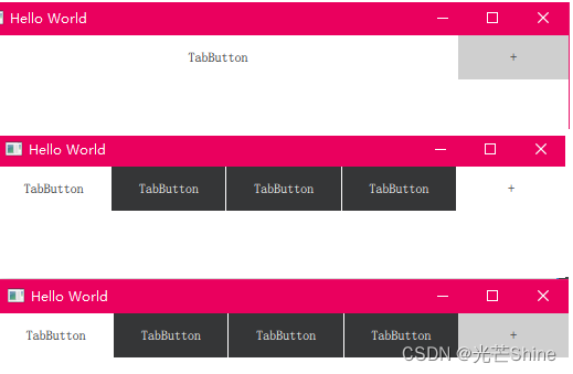
■ Container🏆
Container 提供容器通用功能的抽象基类。
Container是类容器用户界面控件的基本类型,允许动态插入和删除Item。
DialogButtonBox, MenuBar, SwipeView, 和 TabBar 都是继承至这个控件。
例子一 演示了如何将Item动态插入TabBar,这是Container的具体实现之一。
 Row {
      TabBar {
          id: tabBar

          currentIndex: 0
          width: parent.width - addButton.width

          TabButton { text: "TabButton" }
      }

      Component {
          id: tabButton
          TabButton { text: "TabButton" }
      }

      Button {
          id: addButton
          text: "+"
          flat: true
          onClicked: {
              tabBar.addItem(tabButton.createObject(tabBar))
              console.log("added:", tabBar.itemAt(tabBar.count - 1))
          }
      }
  }
示例二:管理当前索引
当使用多个容器时,例如TabBar和SwipeView,它们的currentIndex属性可以相互绑定以保持它们同步。当用户与任何容器交互时,其当前索引的更改自动传播到另一个容器。
- incrementCurrentIndex ()
- decrementCurrentIndex ()
- setCurrentIndex ()
  TabBar {
      id: tabBar
      currentIndex: swipeView.currentIndex
  }

  SwipeView {
      id: swipeView
      currentIndex: tabBar.currentIndex
  }

  Button {
      text: qsTr("Home")
      onClicked: swipeView.setCurrentIndex(0)
      enabled: swipeView.currentIndex != 0
  }

  Button {
      text: qsTr("Previous")
      onClicked: swipeView.decrementCurrentIndex()
      enabled: swipeView.currentIndex > 0
  }

  Button {
      text: qsTr("Next")
      onClicked: swipeView.incrementCurrentIndex()
      enabled: swipeView.currentIndex < swipeView.count - 1
  }
示例三:容器实现
Container不提供任何默认的可视化。它用于实现SwipeView和TabBar等容器。在实现自定义容器时,API中最重要的部分是contentModel,它提供了包含的项目,可以用作项目视图和重复器的委托模型。
  Container {
      id: container
      contentItem: ListView {
          model: container.contentModel
          snapMode: ListView.SnapOneItem
          orientation: ListView.Horizontal
      }
      Text {
          text: "Page 1"
          width: container.width
          height: container.height
      }
      Text {
          text: "Page 2"
          width: container.width
          height: container.height
      }
  }
■ Frame🏆
可视 Frame 中布局一组逻辑控件。这个也是一个内容容器,提供了一个边框,但Frame不提供自己的布局。
示例一:
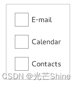
Frame {
      ColumnLayout {
          anchors.fill: parent
          CheckBox { text: qsTr("E-mail") }
          CheckBox { text: qsTr("Calendar") }
          CheckBox { text: qsTr("Contacts") }
      }
  }
示例二:定制化
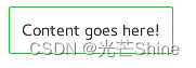
  import QtQuick 2.12
  import QtQuick.Controls 2.12

  Frame {
      background: Rectangle {
          color: "transparent"
          border.color: "#21be2b"
          radius: 2
      }
      Label {
          text: qsTr("Content goes here!")
      }
  }
■ GroupBox🏆
GroupBox用于在一个有标题的可视容器中去布局一组逻辑控件组。GroupBox不提供自己的布局

  GroupBox {
      title: qsTr("Synchronize")
      ColumnLayout {
          anchors.fill: parent
          CheckBox { text: qsTr("E-mail") }
          CheckBox { text: qsTr("Calendar") }
          CheckBox { text: qsTr("Contacts") }
      }
  }
  import QtQuick 2.12
  import QtQuick.Controls 2.12

  GroupBox {
      id: control
      title: qsTr("GroupBox")

      background: Rectangle {
          y: control.topPadding - control.bottomPadding
          width: parent.width
          height: parent.height - control.topPadding + control.bottomPadding
          color: "transparent"
          border.color: "#21be2b"
          radius: 2
      }
      label: Label {
          x: control.leftPadding
          width: control.availableWidth
          text: control.title
          color: "#21be2b"
          elide: Text.ElideRight
      }
      Label {
          text: qsTr("Content goes here!")
      }
  }
■ Page🏆
■ Pane🏆
Pane提供与应用程序样式和主题匹配的背景颜色。Pane不提供自己的布局
示例一:
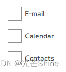
Pane {
     ColumnLayout {
         anchors.fill: parent
         CheckBox { text: qsTr("E-mail") }
         CheckBox { text: qsTr("Calendar") }
         CheckBox { text: qsTr("Contacts") }
     }
 }
■ ScrollView🏆
ScrollView 为用户定义的内容提供滚动功能。
示例一:
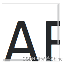
ScrollView {
    width: 400
    height: 200
    clip: true

    Column{
        Label {
            text: "ABC"
            font.pixelSize: 224
        }
        Label {
            text: "ABC"
            font.pixelSize: 224
        }
    }
}
显式地将interactive属性设置为true或false,滚动条可以在触摸时实现交互,也可以在与鼠标设备交互时实现非交互。
ScrollView {
    // ...
    ScrollBar.horizontal.interactive: true
    ScrollBar.vertical.interactive: true
}
■ SplitView 🏆
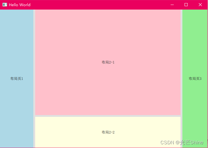
SplitView是一个水平或垂直布局元素的控件,每个元素之间有一个可拖动的分配页面内容的滑块。很像IDE里面的那些窗口。就像下面的简单的布局内容一样。
示例一:
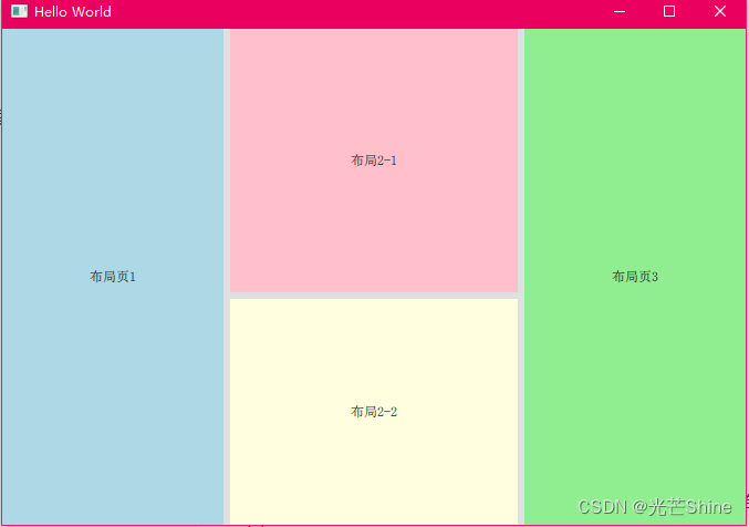
手动调整后:
import QtQuick 2.0
import QtQuick.Controls 2.14
import QtQuick.Window 2.12
import QtQuick.Layouts 1.3
import QtQuick.Controls 2.5

Window {
    visible: true
    width: 640
    height: 480
    title: qsTr("Hello World")


    SplitView {
        anchors.fill: parent
        orientation: Qt.Horizontal

        Rectangle {
            implicitWidth: 200
            SplitView.maximumWidth: 400
            color: "lightblue"
            Label {
                text: "布局页1"
                anchors.centerIn: parent
            }
        }

        SplitView{
            SplitView.minimumWidth: 50
            SplitView.fillWidth: true

            orientation: Qt.Vertical
            Rectangle{
                color: "pink"
                SplitView.minimumHeight: 200
                SplitView.fillWidth: true

                Label{
                    anchors.centerIn: parent

                    text: "布局2-1"
                }
            }

            Rectangle{
                color: "lightyellow"

                SplitView.minimumHeight: 100
                SplitView.fillWidth: true

                Label{
                    anchors.centerIn: parent

                    text: "布局2-2"
                }
            }
        }

        Rectangle {
            implicitWidth: 200
            color: "lightgreen"
            Label {
                text: "布局页3"
                anchors.centerIn: parent
            }
        }
    }
}
■ StackView 🏆
StackView支持三种主要的导航操作:push()、pop()和replace()。
“push”操作将一个元素添加到栈顶
“pop”操作将栈顶的元素删除
“replace”操作类似于先弹出后推操作,即用新元素替换最上面的元素。栈中最顶层的元素对应于屏幕上当前可见的元素。从逻辑上讲,“push”在应用UI中是向前或更深入的,“pop”是向后导航,而“replace”则是替换当前内容。
示例一:
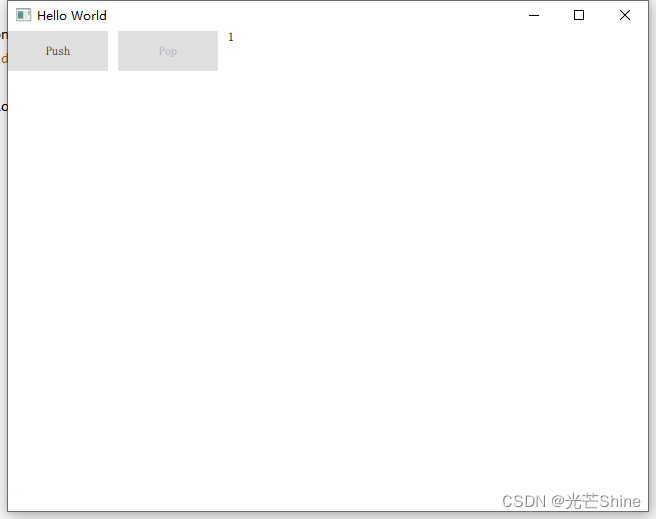
 ApplicationWindow {
      title: qsTr("Hello World")
      width: 640
      height: 480
      visible: true

      StackView {
          id: stack
          initialItem: mainView
          anchors.fill: parent
      }

      Component {
          id: mainView
          Row {
              spacing: 10
              Button {
                  text: "Push"
                  onClicked: stack.push(mainView)
              }
              Button {
                  text: "Pop"
                  enabled: stack.depth > 1
                  onClicked: stack.pop()
              }
              Text {
                  text: stack.depth
              }
          }
      }
  }
■ SwipeView
SwipeView提供了一个基于滑动的导航模型
SwipeView用一组页面填充。一次只能看到一页。用户可以通过横向滑动在页面之间导航。请注意,SwipeView本身是完全非视觉的。建议将其与PageIndicator结合使用,给用户一个有多个页面的视觉线索。
示例一:
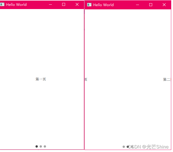
import QtQuick 2.12
import QtQuick.Window 2.12
import QtQuick.Layouts 1.3
import QtQuick.Controls 2.5
Window {
    visible: true
    width: 640
    height: 480
    title: qsTr("Hello World")
    SwipeView {
        id: view
        currentIndex: 1
        anchors.fill: parent

        Item {
            id: firstPage

            Label{
                text: "第一页"
                anchors.centerIn: parent
            }
        }
        Item {
            id: secondPage
            Label{
                text: "第二页"
                anchors.centerIn: parent
            }
        }
        Item {
            id: thirdPage
            Label{
                text: "第三页"
                anchors.centerIn: parent
            }
        }
    }
    PageIndicator {
        id: indicator
        count: view.count
        currentIndex: view.currentIndex
        anchors.bottom: view.bottom
        anchors.horizontalCenter: parent.horizontalCenter
    }
}
■ TabBar
TabBar其实就是选项卡,TabBar是由TabButton控件填充,TabBar可以与任何提供currentIndex属性的布局或容器控件一起使用,如StackLayout或SwipeView。
示例一:
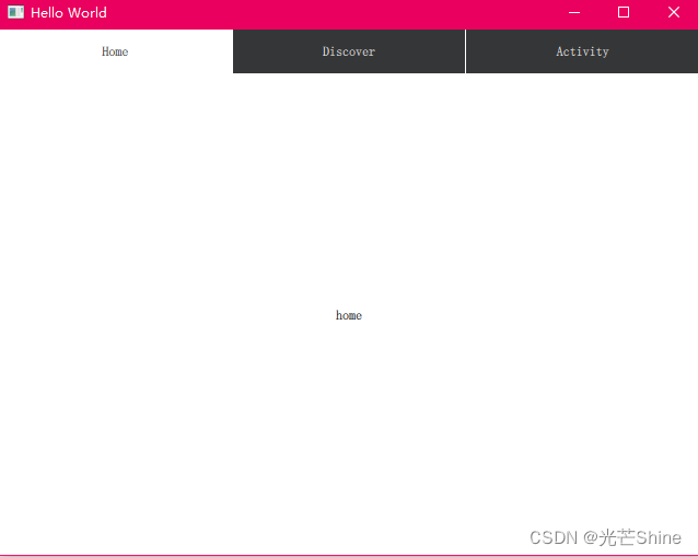
import QtQuick 2.12
import QtQuick.Window 2.12
import QtQuick.Layouts 1.3
import QtQuick.Controls 2.5

Window {
    visible: true
    width: 640
    height: 480
    title: qsTr("Hello World")

    TabBar {
        id: bar
        width: parent.width
        TabButton {
            text: qsTr("Home")
        }
        TabButton {
            text: qsTr("Discover")
        }
        TabButton {
            text: qsTr("Activity")
        }
    }

    StackLayout {
        id:stackLayout
        anchors.topMargin: 41
        anchors.fill: parent
        currentIndex: bar.currentIndex

        Item {
            id: homeTab
            Text {
                id: homeLabel
                x: 308
                y: 196
                text: qsTr("home")
                anchors.verticalCenter: parent.verticalCenter
                anchors.horizontalCenter: parent.horizontalCenter
            }
        }
        Item {
            id: discoverTab
            Text {
                id: discoverLabel
                x: 308
                y: 196
                text: qsTr("discover")
                anchors.verticalCenter: parent.verticalCenter
                anchors.horizontalCenter: parent.horizontalCenter
            }
        }
        Item {
            id: activityTab
            Text {
                id: activityLabel
                x: 308
                y: 196
                text: qsTr("activity")
                anchors.verticalCenter: parent.verticalCenter
                anchors.horizontalCenter: parent.horizontalCenter
            }
        }
    }
}
■ ToolBar
ToolBar是应用程序范围内和上下文里面便捷的操作和控件的容器,例如导航按钮和搜索字段。其实本质上就是一个装东西的容器。
示例一:
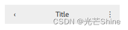
  ApplicationWindow {
      visible:true

      header: ToolBar {
          RowLayout {
              anchors.fill: parent
              ToolButton {
                  text: qsTr("?")
                  onClicked: stack.pop()
              }
              Label {
                  text: "Title"
                  elide: Label.ElideRight
                  horizontalAlignment: Qt.AlignHCenter
                  verticalAlignment: Qt.AlignVCenter
                  Layout.fillWidth: true
              }
              ToolButton {
                  text: qsTr("?")
                  onClicked: menu.open()
              }
          }
      }

      StackView {
          id: stack
          anchors.fill: parent
      }
  }
示例二:
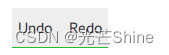
  ToolBar {
      id: control

      background: Rectangle {
          implicitHeight: 40
          color: "#eeeeee"

          Rectangle {
              width: parent.width
              height: 1
              anchors.bottom: parent.bottom
              color: "transparent"
              border.color: "#21be2b"
          }
      }

      RowLayout {
          anchors.fill: parent
          ToolButton {
              text: qsTr("Undo")
          }
          ToolButton {
              text: qsTr("Redo")
          }
      }
  }
本文来自互联网用户投稿,该文观点仅代表作者本人,不代表本站立场。本站仅提供信息存储空间服务,不拥有所有权,不承担相关法律责任。 如若内容造成侵权/违法违规/事实不符,请联系我的编程经验分享网邮箱:veading@qq.com进行投诉反馈,一经查实,立即删除!