flex布局,换行的元素上下设置间距
2023-12-13 04:25:10
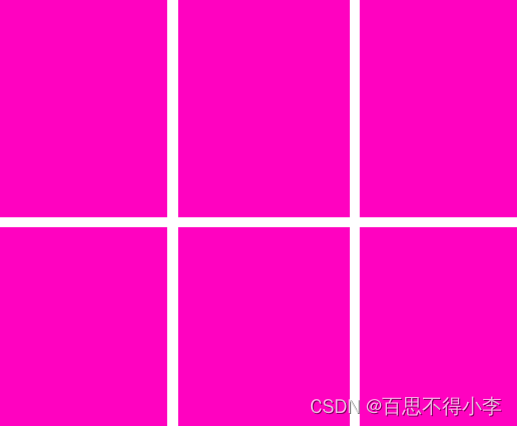
要生成的效果图如下:
 display:flex
 flex-direction: row;
 flex-wrap: wrap;
当我们使用弹性盒子布局后,默认元素是没有外边距的,紧挨着样式就有点丑,如果想使换行后,元素的外边距有个距离,可以用如下方法解决
解决办法
1.父元素定高的情况下,直接使用 align-content: space-between;
       ul{
            list-style: none;
            display: flex;
            height: 614px;
            flex-direction: row;
            flex-wrap: wrap;
            justify-content: space-between;
            align-content: space-between;
        }
        ul li{
            width: 234px;
            height: 300px;
            background-color: rgb(255, 2, 192);
        }
2.父元素不定高的情况下
1)设置需要更改间距的元素(li)的margin-bottom:14px,然后用父容器(ul)的margin-bottom: -14px;来抵消。
       ul{
            list-style: none;
            display: flex;
            flex-direction: row;
            flex-wrap: wrap;
            margin-bottom: -14px;
            justify-content: space-between;
            align-content: space-between;
        }
        li{
            margin-bottom: 14px;
        }
   ul li{
            display: flex;
            width: 234px;
            height: 300px;
            background-color: rgb(255, 2, 192);
        }
2) 设置需要更改间距的元素(li)的margin-bottom:14px;然后使用结构伪类选择器设置最后的几个元素margin-bottom: 0 ;
      ul{
            list-style: none;
            display: flex;
            flex-direction: row;
            flex-wrap: wrap;
            justify-content: space-between;
            align-content: space-between;
        }
        li{
            margin-bottom: 14px;
        }
       li:nth-child(n+5){
            margin-top: 0;
        }
        ul li{
            display: flex;
            width: 234px;
            height: 300px;
            background-color: rgb(255, 2, 192);
        }
文章来源:https://blog.csdn.net/qq_37635012/article/details/134955994
本文来自互联网用户投稿,该文观点仅代表作者本人,不代表本站立场。本站仅提供信息存储空间服务,不拥有所有权,不承担相关法律责任。 如若内容造成侵权/违法违规/事实不符,请联系我的编程经验分享网邮箱:veading@qq.com进行投诉反馈,一经查实,立即删除!
本文来自互联网用户投稿,该文观点仅代表作者本人,不代表本站立场。本站仅提供信息存储空间服务,不拥有所有权,不承担相关法律责任。 如若内容造成侵权/违法违规/事实不符,请联系我的编程经验分享网邮箱:veading@qq.com进行投诉反馈,一经查实,立即删除!