vue:antV | G6的超级详细使用(包括基本使用、示例使用、自定义节点以及增删改查功能的灵活应用)
2023-12-21 11:15:16
目录
- 小编利用如下知识实现的最终功能效果(工作的反诈系统的demo)
第一章 理解基本信息
1.1 安装与引入
- 在项目中通过 npm/yarn 安装
npm install --save @antv/g6
yarn add --save @antv/g6- 在需要用的 G6 的 js?/ vue 文件中导入?
import G6 from "@antv/g6"1.2 了解基本使用
1.2.1 创建容器
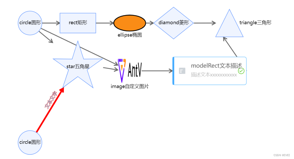
<div id="mountNode"></div>- ?准备数据,这里写了一下几种最常见的,也是官方展示的,节点类型、属性样式看如下官网:
1.2.2 节点信息?
// 节点信息
nodes = [
  {
    // 点的数据
    id: 'node0',
    x: 100, // 节点x轴位置
    y: 400, // 节点y轴位置
    size: 60, // 图形尺寸,注意:该数据类型会根据type变化,一定要看官方文档,这里表示的是圆的直径
    type: 'circle', // 节点的形状
    label: 'circle圆形' // 节点的文本名称
  },
  {
    id: 'node1',
    x: 100,
    y: 100,
    size: 60,
    type: 'circle',
    label: 'circle圆形'
  },
  {
    id: 'node2',
    x: 220,
    y: 100,
    size: [90, 50], // 数组的形式,节点的长宽值
    type: 'rect',
    label: 'rect矩形'
  },
  {
    id: 'node3',
    x: 350,
    y: 100,
    size: [80, 40],
    type: 'ellipse',
    label: 'ellipse椭圆',
    labelCfg: { // 文本配置项
      position: 'bottom', // 文本相对于节点的位置
      offset: 5, // 文本的偏移
      style: {} // 设置文本标签的样式
    },
    style: { // 设置节点的样式 (注意区分上面的style对象)
      fill: '#fa8c16', // 节点填充色
      stroke: '#000', // 节点的描边颜色
      lineWidth: 2 // 描边宽度
    }
  },
  {
    id: 'node4',
    x: 460,
    y: 100,
    size: [100, 80],
    type: 'diamond',
    label: 'diamond菱形'
  },
  {
    id: 'node5',
    x: 600,
    y: 100,
    type: 'triangle',
    label: 'triangle三角形',
    labelCfg: {
      position: 'right',
      offset: 5
    }
  },
  {
    id: 'node6',
    x: 220,
    y: 210,
    size: 65,
    type: 'star',
    label: 'star五角星'
  },
  {
    id: 'node7',
    x: 350,
    y: 220,
    size: 60,
    type: 'image',
    img: 'https://gw.alipayobjects.com/os/s/prod/antv/assets/image/logo-with-text-73b8a.svg', // 图片路径
    label: 'image自定义图片'
  },
  {
    id: 'node8',
    x: 550,
    y: 220,
    description: '描述文本xxxxxxxxxxx', // 描述
    type: 'modelRect',
    label: 'modelRect文本描述'
  }
],
1.2.3 边信息
(可以参照小编的第一条线设置看官方文档的自定义或许会相对比较容易)
edges = [
  {
    source: 'node0', // 起始点id
    target: 'node6', // 结束点id
    type: 'line', // 边的类型,默认为 'line'
    label: '文本文字', // 文本文字,没有则不会显示
    labelCfg: { // 文本配置
      refX: '0', // 标签在 x 方向的偏移量
      refY: '10', // 标签在 y 方向的偏移量
      position: 'top', // 文本相对于边的位置
      autoRotate: true, // 标签文字是否跟随边旋转
      style: { // 文本样式
        fill: 'skyblue', // 文本颜色
        stroke: 'red', // 文本描边颜色
        lineWidth: 1, // 文本描边粗细
        opacity: 0.9 // 文本透明度
        // ……
      }
    }, // 文本文字的配置样式
    style: { // 修改边的属性
      endArrow: true, // 结束端绘制箭头
      lineWidth: 4, // 线宽
      stroke: 'red' // 边颜色
    }
  },
  {
    source: 'node1',
    target: 'node2'
  },
  {
    source: 'node2',
    target: 'node3'
  },
  {
    source: 'node1',
    target: 'node3'
  },
  {
    source: 'node3',
    target: 'node4'
  },
  {
    source: 'node4',
    target: 'node5'
  },
  {
    source: 'node1',
    target: 'node6'
  },
  {
    source: 'node1',
    target: 'node7'
  },
  {
    source: 'node6',
    target: 'node7'
  },
  {
    source: 'node7',
    target: 'node8'
  },
  {
    source: 'node8',
    target: 'node5'
  }
]
?1.2.4 图配置
- 创建关系图(实例化)-- 小编这里是至少基础demo,详细配置还需看官网
const graph = new G6.Graph({
  container: 'mountNode', // 图的 DOM 容器,可以传入该 DOM 的 id 或者直接传入容器的 HTML 节点对象
  width: 1000, // 指定画布宽度,单位为 'px',默认为画布容器宽度
  height: 500, // 指定画布高度,单位为 'px',默认为画布容器高度
  modes: {
    // default: ['drag-canvas', 'zoom-canvas', 'drag-node'] // 允许拖拽画布、放缩画布、拖拽节点
    default: ['drag-canvas', 'drag-node'] // 允许拖拽画布、拖拽节点
  },
  fitView: true, // 是否开启画布自适应。开启后图自动适配画布大小。
  defaultEdge: { // 默认状态下边的配置,可看上一节
    type: 'line',
    style: {
      endArrow: true,
      lineWidth: 2,
      stroke: '#666'
    }
  }
})
1.2.5 渲染图数据
// 注意这两需要搭配使用才会有效果
graph.data(data) // 初始化的图数据,是一个包括 nodes 数组和 edges 数组的对象
graph.render() // 接收数据,并进行渲染,read 方法的功能相当于 data 和 render 方法的结合
1.2.6 demo源代码
- 初始化g6跟着小编这个demo走,基本上能实现大部分你想要的绘图效果
initG6() {
  // 节点信息
  nodes = [
    {
        // 点的数据
        id: 'node0',
        x: 100, // 节点x轴位置
        y: 400, // 节点y轴位置
        size: 60, // 图形尺寸
        type: 'circle', // 节点的形状
        label: 'circle圆形' // 节点内的文本名称
    },
    {
        // 点的数据
        id: 'node1',
        x: 100, // 节点x轴位置
        y: 100, // 节点y轴位置
        size: 60, // 图形尺寸
        type: 'circle', // 节点的形状
        label: 'circle圆形' // 节点内的文本名称
    },
    {
        id: 'node2',
        x: 220,
        y: 100,
        size: [90, 50], // 节点的长宽值
        type: 'rect',
        label: 'rect矩形'
    },
    {
        id: 'node3',
        x: 350,
        y: 100,
        size: [80, 40],
        type: 'ellipse',
        label: 'ellipse椭圆',
        labelCfg: {
          position: 'bottom',
          offset: 5
        },
        style: {
          fill: '#fa8c16',
          stroke: '#000',
          lineWidth: 2
        }
    },
    {
        id: 'node4',
        x: 460,
        y: 100,
        size: [100, 80],
        type: 'diamond',
        label: 'diamond菱形'
    },
    {
        id: 'node5',
        x: 600,
        y: 100,
        type: 'triangle',
        label: 'triangle三角形',
        labelCfg: {
          position: 'right',
          offset: 5
        }
    },
    {
        id: 'node6',
        x: 220,
        y: 210,
        size: 65,
        type: 'star',
        label: 'star五角星'
    },
    {
        id: 'node7',
        x: 350,
        y: 220,
        size: 60,
        type: 'image',
        img: 'https://gw.alipayobjects.com/os/s/prod/antv/assets/image/logo-with-text-73b8a.svg',
        label: 'image自定义图片'
    },
    {
        id: 'node8',
        x: 550,
        y: 220,
        description: '描述文本xxxxxxxxxxx',
        type: 'modelRect',
        label: 'modelRect文本描述'
    }
  ],
  // 边信息
  edges = [
    {
        source: 'node0', // 起始点id
        target: 'node6', // 结束点id
        type: 'line', // 边的类型,默认为 'line'
        label: '文本文字', // 文本文字,没有则不会显示
        labelCfg: { // 文本配置
          refX: '0', // 标签在 x 方向的偏移量
          refY: '10', // 标签在 y 方向的偏移量
          position: 'top', // 文本相对于边的位置
          autoRotate: true, // 标签文字是否跟随边旋转
          style: { // 文本样式
            fill: 'skyblue', // 文本颜色
            stroke: 'red', // 文本描边颜色
            lineWidth: 1, // 文本描边粗细
            opacity: 0.9 // 文本透明度
            // ……
          }
        }, // 文本文字的配置样式
        style: { // 修改边的属性
          endArrow: true, // 结束端绘制箭头
          lineWidth: 4, // 线宽
          stroke: 'red' // 边颜色
        }
    },
    {
        source: 'node1',
        target: 'node2'
    },
    {
        source: 'node2',
        target: 'node3'
    },
    {
        source: 'node1',
        target: 'node3'
    },
    {
        source: 'node3',
        target: 'node4'
    },
    {
        source: 'node4',
        target: 'node5'
    },
    {
        source: 'node1',
        target: 'node6'
    },
    {
        source: 'node1',
        target: 'node7'
    },
    {
        source: 'node6',
        target: 'node7'
    },
    {
        source: 'node7',
        target: 'node8'
    },
    {
        source: 'node8',
        target: 'node5'
    }
  ]
  // 数据汇总
  const data = {
    nodes: nodes,
    edges: edges
  }
  // 图实例化
  const graph = new G6.Graph({
    container: 'mountNode',
    width: 1000,
    height: 600,
    modes: {
      // default: ['drag-canvas', 'zoom-canvas', 'drag-node'] // 允许拖拽画布、放缩画布、拖拽节点
      default: ['drag-canvas', 'drag-node'] // 允许拖拽画布、拖拽节点
    },
    fitView: true,
    defaultEdge: {
      type: 'line',
      style: {
        endArrow: true,
        lineWidth: 2,
        stroke: '#666'
      }
    }
  })
  // 图渲染数据
  graph.data(data)
  graph.render()
},
1.2.7 实现效果?
第二章 g6图表示例使用?
2.1 示例代码的展及解释
initG6 () {
// 数据请求
fetch('https://gw.alipayobjects.com/os/antvdemo/assets/data/algorithm-category.json')
.then((res) => res.json())
.then((data) => {
// 获取容器id
const container = document.getElementById('mountNode')
// 宽高
const width = container.scrollWidth
const height = container.scrollHeight || 600
// 图配置,注意这里是TreeGraph --> 树图, Graph --> 图
const graph = new G6.TreeGraph({
container: 'mountNode',
width,
height,
modes: {
default: [ // 官方文档给的不是很明确,有很多方法需要我们通过样例了解
{
type: 'collapse-expand', // 节点的展示
onChange: function onChange(item, collapsed) {
const data = item.getModel()
data.collapsed = collapsed
return true
}
},
'drag-canvas', // 拖动
'zoom-canvas' // 缩放
]
},
defaultNode: { // 设置默认节点
size: 26, // 节点大小
anchorPoints: [ // 指定边连入节点的连接点的位置
[0, 0.5],
[1, 0.5]
]
},
defaultEdge: { // 设置默认边
type: 'cubic-horizontal' // 边类型
},
layout: {
type: 'compactBox', // 树布局
direction: 'LR', // 看官网, 以下配置需要根据官网给的参数进行自定义配置
getId: function getId(d) { // 节点 id 的回调函数
return d.id
},
getHeight: function getHeight() { // 每个节点的高度
return 16
},
getWidth: function getWidth() { // 每个节点的宽度
return 16
},
getVGap: function getVGap() { // 每个节点的垂直间隙
return 10
},
getHGap: function getHGap() { // 每个节点的水平间隙
return 100
}
}
})
graph.node(function (node) { // 对各个节点样式及其他配置进行设置
return {
label: node.id,
labelCfg: {
offset: 10,
position: node.children && node.children.length > 0 ? 'left' : 'right'
}
}
})
graph.data(data) // 初始化数据
graph.render() // 渲染
graph.fitView() // 支持伸缩
if (typeof window !== 'undefined') { // 尺寸自适应
window.onresize = () => {
if (!graph || graph.get('destroyed')) return
if (!container || !container.scrollWidth || !container.scrollHeight) return
graph.changeSize(container.scrollWidth, container.scrollHeight)
}
}
})
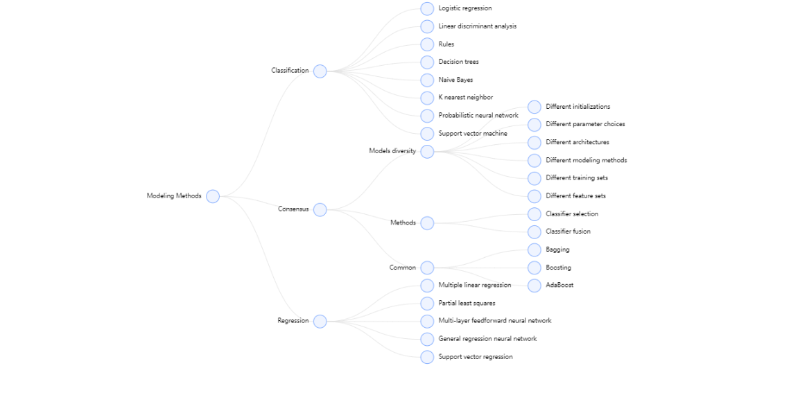
},2.2 示例效果
第三章 自定义图demo及增删改查基本功能
3.1 自定义图
3.1.1 核心:自定义节点
- 当内置节点不满足需求时,可以通过?G6.registerNode(nodeName, options, extendedNodeName) 方法自定义节点
| nodeName | 自定义节点名称,需保持唯一性。 |
| options | 自定义节点时的配置项 |
| extendNodeName | 自定义节点时可基于内置节点进行定义,该字段表示内置节点名称 |
- 通过小编的例子了解配置项
1、理解group.addShape(type, cfgs):向分组中添加新的图形,type为图元素类型,值可以为:'rect'、'circle'、'fan'、'ellipse'、'marker'、'image' 等,cfgs为图元素的属性
(注意,大致配置可以看小编的demo,但是详细配置还是需要看文档的,小编也不会用的特别全,只是捋一下思路,防止我们前端开发时找不到方向)
2、1中type图形以及属性了解
3、了解实例方法
// 自定义节点函数,card-node为节点类型,后续会用
G6.registerNode("card-node", {
// 自定义节点样式,绘制节点,包含文本
// cfg 节点的配置项,group 图形分组,节点中的图形对象的容器
// 小编这里是利用矩形画的组合的内容
draw: function drawShape(cfg, group) {
  const r = 4; // 圆角
  const w = cfg.size[0]; // 宽度
  const h = cfg.size[1]; // 高度
  const { data } = cfg;
  // 最大的矩形盒子的宽高以及位置
  // rect -> type类型表示矩形
  const shape = group.addShape("rect", {
    attrs: {
      x: -w / 2, // 矩形左上角的 x 坐标
      y: -h / 2, // 矩形左上角的 y 坐标
      width: 280, // 280, // 矩形的宽度
      height: 173, // 173 // 矩形的高度
      radius: r, // 定义圆角,值或者数组
      // 从这以下----------都是图形type的通用属性
      fill: "#fff", // 设置用于填充绘画的颜色、渐变或模式(背景色)
      // (从这----------盒子的阴影,css的box-shadow属性)
      shadowOffsetX: 0, // 设置阴影距形状的水平距离
      shadowOffsetY: 4, // 设置阴影距形状的垂直距离
      shadowColor: "rgba(0,0,0,0.1)", // 设置用于阴影的颜色
      shadowBlur: 8, 设置用于阴影的模糊级别
      // (到这----------)
    },
    name: "main-box", // 唯一识别的命名(注意这个名与G6.registerNode命名有区别,都很重要)
    draggable: true, // 是否支持拖动
    model: {},
  });

  // 下面是上面那个大矩形盒子的子内容
  group.addShape("rect", {
    attrs: {
      x: -w / 2,
      y: -h / 2,
      width: w,
      height: 74,
      fill: that.bgColor[data.category], // 颜色动态渲染
      radius: [r, r, 0, 0],
    },
    name: "top-box",
  });
  //  cardNumber卡号 ---- 设置
  const cardNumberText = group.addShape("text", {
    attrs: {
      fontSize: 14, // 文字大小
      lineHeight: 22, // 行高
      text: data.cardNumber, // 文字内容
      fill: "#fff",  // 设置用于填充绘画的颜色、渐变或模式(文字颜色)
    },
    name: "institution-title",
  });
  // item.getBBox()获取元素的包围盒,(涉及一下),text本身也能定位的
  const cardNumberTextBox = cardNumberText.getBBox();
  cardNumberText.attr({
    x: -w / 2 + 8, // 左上角x坐标
    y: -h / 2 + cardNumberTextBox.height + 8, // 左上角y坐标
  });
  // 以下我只要是文字就这么设计,小编会删掉一部分类似的代码
  // 机构---------位置
  const institutionText = group.addShape("text", {
    attrs: {
      fontSize: 14,
      lineHeight: 22,
      text: data.institution.length < 18 ? data.institution : data.institution.slice(0, 18) + "···",
      fill: "#fff",
    },
    name: "institution-title",
  });
  // 获取机构文本的盒子
  const institutionTextBox = institutionText.getBBox();
  institutionText.attr({
    x: -w / 2 + 8, // x坐标
    y: -h / 2 + institutionTextBox.height + 30, // y坐标
  });
  // 由于等级涉及到了一部分的背景色,所以添加一个矩形盒子做背景,然后再添加文字
  // grade等级 ---- 设置
  const gradeRect = group.addShape("rect", {
    attrs: {
      width: 50,
      height: 24,
      fill: "#fff",
      radius: [0, 4, 0, 10],
    },
    name: "grade-rect",
  });
  const gradeText = group.addShape("text", {
    attrs: {
      fontSize: 14,
      lineHeight: 22,
      text: data.grade + "级",
      fill: that.bgColor[data.category],
    },
    name: "grade-title",
  });
  // 这里是对矩形盒子与文字定位,使文章能居中矩形
  const gradeRectBox = gradeRect.getBBox();
  const gradeTextBox = gradeText.getBBox();
  gradeRect.attr({
    x: w / 2 - gradeRectBox.width,
    y: -h / 2,
  });
  gradeText.attr({
    x: w / 2 - gradeTextBox.width - 12, // x坐标
    y: -h / 2 + gradeTextBox.height + 7, // y坐标
  });
  // ---自此,小编demo绘制图形最常用的知识点就在上面了
  // 绘制边界线
  group.addShape("rect", {
    attrs: {
      width: w,
      height: 1,
      fill: "#D9D9D9",
      radius: 2,
      x: -w / 2,
      y: -h / 2 + 138,
    },
    name: "tag-rect",
  });
  // 以下就是功能模块的实现 ---------------
  // tools矩形框 ---- 设置
  const tools = group.addShape("rect", {
    attrs: {
      width: w,
      height: 32,
      radius: r,
      fill: "#fff",
      shadowOffsetX: 0,
      shadowOffsetY: 4,
      shadowColor: "rgba(0,0,0,0.1)",
      shadowBlur: 8,
    },
    name: "tools-box",
  });
  tools.attr({
    x: -w / 2,
    y: h / 2 + 4,
  });
  // 添加同级 ---- 设置
  const peerAdd = group.addShape("image", { // 这里的类型
    attrs: {
      height: 24,
      width: 70,
      cursor: "pointer",
      img: require("./z-img/peer.png"), // 注意:这本地图片小编用require的方式实现的
    },
    name: "peer-item", // 这里的名称,在后续执行逻辑的时候就会用到了,所以定义时语义化点
  });
  peerAdd.attr({
    x: -w / 2 + 15,
    y: h / 2 + 8,
  });
  // 添加下级 ---- 设置
  const juniorAdd = group.addShape("image", {
    attrs: {
      height: 24,
      width: 70,
      cursor: "pointer",
      img: require("./z-img/junior.png"),
    },
    name: "junior-item",
  });
  juniorAdd.attr({
    x: -w / 2 + 105,
    y: h / 2 + 8,
  });
  // 删除节点 ---- 设置
  const nodeDelete = group.addShape("image", {
    attrs: {
      height: 24,
      width: 70,
      cursor: "pointer",
      img: require("./z-img/delete.png"),
    },
    name: "delete-item",
  });
  nodeDelete.attr({
    x: -w / 2 + 195,
    y: h / 2 + 8,
  });
  // 更新数据 ---- 设置
  const nodeUpdate = group.addShape("image", {
    attrs: {
      height: 22,
      width: 70,
      cursor: "pointer",
      img: require("./z-img/update.png"),
    },
    name: "update-item",
  });
  const nodeUpdateBox = nodeUpdate.getBBox();
  nodeUpdate.attr({
    x: -w / 2,
    y: -h / 2 - nodeUpdateBox.height - 4,
  });
  // 编辑 ---- 设置
  const nodeEdit = group.addShape("image", {
    attrs: {
      height: 22,
      width: 44,
      cursor: "pointer",
      img: require("./z-img/edit.png"),
    },
    name: "edit-item",
  });
  const nodeEditBox = nodeEdit.getBBox();
  nodeEdit.attr({
    x: -w / 2 + 95,
    y: -h / 2 - nodeEditBox.height - 4,
  });
  // 这个逻辑是确定终结点是否展示的,小编的demo中有
  // 没有子节点添加终结点同时没有原因
  if ((!cfg.children || !cfg.children.length) && cfg.reason === "") {
    // 终结点 ---- 设置
    const nodeLast = group.addShape("image", {
      attrs: {
        height: 22,
        width: 56,
        cursor: "pointer",
        img: require("./z-img/lastnode.png"),
      },
      name: "last-item",
    });
    // const nodeEditBox = nodeEdit.getBBox();
    nodeLast.attr({
      x: w / 2 + 8,
      y: h / 2 + 8,
    });
  }
  if (!cfg.children.length && cfg.reason !== "") {
    // 高度设置,这里将终结原因进行分割,然后渲染上去
    cfg.reason =
      cfg.reason.length < 14 * 4
        ? cfg.reason
        : cfg.reason.slice(0, 52) + "···";
    const str = cfg.reason.replace(/(.{14})/g, "$1,");
    const strlength = str.split(",").length;
    // 终结原因 ---- 设置
    // 1、矩形框
    const nodeLastRect = group.addShape("rect", {
      attrs: {
        height: 60 + 20 * strlength,
        width: 240,
        radius: r,
        fill: "#fff",
        shadowOffsetX: 0,
        shadowOffsetY: 4,
        shadowColor: "rgba(0,0,0,0.1)",
        shadowBlur: 8,
      },
      name: "lastRect-item",
    });
    nodeLastRect.attr({
      x: w / 2 + 8,
      y: -h / 2,
    });
    // 2、侧边彩色矩形
    const nodeLastleft = group.addShape("rect", {
      attrs: {
        height: 60 + 20 * strlength,
        width: 16,
        radius: [r, 0, 0, r],
        fill: "#FA541C",
        shadowOffsetX: 0,
        shadowOffsetY: 4,
        shadowColor: "rgba(0,0,0,0.1)",
        shadowBlur: 8,
      },
      name: "LastleftRect-item",
    });
    nodeLastleft.attr({
      x: w / 2 + 8,
      y: -h / 2,
    });
    // 3、标签卡
    const flag = group.addShape("image", {
      attrs: {
        height: 27,
        width: 24,
        img: require("./z-img/flag.png"),
      },
      name: "flag-item",
    });
    flag.attr({
      x: w / 2 + 21,
      y: -h / 2 + 4,
    });
    // 4、终结原因标题
    const titleText = group.addShape("text", {
      attrs: {
        fontSize: 14,
        lineHeight: 22,
        text: "终结原因:",
        fill: "#434343",
      },
      name: "title-item",
    });
    const titleTextBox = titleText.getBBox();
    titleText.attr({
      x: w / 2 + 30,
      y: -h / 2 + titleTextBox.height + 24,
    });
    // 5、终结原因内容
    const contentText = group.addShape("text", {
      attrs: {
        fontSize: 14,
        lineHeight: 22,
        text: cfg.reason.replace(/(.{14})/g, "$1\n"),
        fill: "#434343",
      },
      name: "content-item",
    });
    const contentTextBox = contentText.getBBox();
    contentText.attr({
      x: w / 2 + 30,
      y: -h / 2 + contentTextBox.height + 46,
    });
  }
  // 返回绘制的自定义节点图形
  return shape;
},
setState(name, value, item) {
  if (name === "collapsed") {
    const marker = item.get("group").find((ele) => ele.get("name") === "collapse-icon");
    const icon = value ? G6.Marker.expand : G6.Marker.collapse;
    marker.attr("symbol", icon);
  }
},
)
3.1.2 使用自定义节点
- node的type放我们自定义节点的name
nodes = [
    {
        // 点的数据
        id: 'node0',
        x: 100, // 节点x轴位置
        y: 400, // 节点y轴位置
        size: 60, // 图形尺寸
        type: 'card-node', // 将自定义形状的name放在type这
        label: 'circle圆形' // 节点内的文本名称
    },
]
3.1.3 核心:边——处理节点位置以及边
- 理解就行,这里是小编demo的简单逻辑。
- 涉及到这一块事就需要看大家算法了!!?
initData() {
  // 节点的x坐标:通过等级控制每个节点横坐标的位置
  // 节点的y坐标:通过同一等级的数量控制节点的纵坐标
  const height = this.computeHeight() * 360;
  const width = this.computeMaxGrade() * 500;
  // 计算最高等级
  const maxGrade = this.computeMaxGrade();
  // 计算每个等级的数量
  const gradeNum = this.computeGradeNum();
  let xStart = 0 - width / 2;
  let yStart = height / 2;
  // 处理x轴坐标
  this.nodes.forEach((item) => {
    // 盒子的大小
    item.size = [280, 173];
    // 节点的类别 -- 自定义
    item.type = "card-node";
    // x 轴坐标
    for (let grade = 1; grade <= maxGrade; grade++) {
      if (Number(item.data.grade) === grade) {
        item.x = xStart + (Number(item.data.grade) - 1) * 500;
        break;
      }
    }
  });
  let yObj = [];
  gradeNum.forEach((item) => {
    for (let i in item) {
      yObj.push({ [i]: 0 });
    }
  });
  let edges = [];
  this.nodes.forEach((item) => {
    // 处理y轴坐标
    for (let grade = 1; grade <= maxGrade; grade++) {
      if (Number(item.data.grade) === grade) {
        let yRest = (height - 360 * gradeNum[grade - 1][grade]) / 2;
        console.log("a" + grade + yObj[grade - 1][grade]++ + yRest);
        item.y = yStart - yRest - (yObj[grade - 1][grade] - 1) * 360;
      }
    }
    // 处理节点指向 ==> 遍历子节点得到哪个节点指向哪个节点
    for (let i = 0; i < item.children.length; i++) {
      edges.push({
        source: item.id,
        target: item.children[i],
      });
    }
  });
  this.edges = edges;
  console.log("height,width", height, width, gradeNum, nodes, yObj, edges);
},
3.1.4 渲染数据并实现增删改查的功能
- 为图上的每一个节点绑定点击事件,?graph.on(eventName, (evt) => {})件,eventName点击事件node:click, evt参数里面包括了这个节点的所有信息,从而通过自定义节点时的名字、图形类别实现我们需要点击子内容功能实现
initG6() {
const that = this;
// 自定义节点
……
// 自定义节点的代码
// 准备好数据
const data = {
nodes: that.nodes,
edges: that.edges,
};
// 获取容器
const container = this.$refs.container;
// 宽高
const height = that.computeHeight() * 360;
const width = that.computeWidth() * 500;
// 实例化
const graph = new G6.Graph({
container: container,
// 终结点额外宽度240
width: width + 240,
height: height,
modes: {
// default: ['drag-canvas', 'zoom-canvas', 'drag-node'] // 允许拖拽画布、放缩画布、拖拽节点
default: ["drag-canvas", "drag-node"], // 允许拖拽画布、拖拽节点
},
fitView: true,
defaultEdge: {
shape: "quadratic",
style: {
endArrow: true,
lineWidth: 2,
stroke: "#666",
},
},
});
this.graph = graph;
graph.data(data);
graph.render();
// 绑定点击事件
graph.on("node:click", (evt) => {
const { item, target } = evt;
// 获取节点类型
const targetType = target.get("type");
const name = target.get("name");
// type 为 image
if (targetType === "image") {
const model = item.getModel();
// 通过名字确定我们需要实现的什么功能
if (name === "junior-item") {
// 添加下级
// 调用添加的方法
this.addJuniorItem(this.nodes, model);
} else if (name === "peer-item") {
// 添加同级
// 调用同级的方法
this.toSingleSearch();
this.model = model;
} else if (name === "update-item") {
console.log("这里是更新账户数据");
this.dateVisible = true;
this.model = model;
} else if (name === "edit-item") {
console.log("这里是编辑账户数据", model.id);
this.editVisible = true;
this.model = model;
} else if (name === "remove-item") {
// graph.removeChild(model.id);
} else if (name === "last-item") {
console.log("这里是填写终结点原因", model.id);
this.lastVisible = true;
this.model = model;
} else if (name === "delete-item") {
console.log("这里是删除节点", model.id);
this.model = model;
this.deleteNode(model);
}
}
});
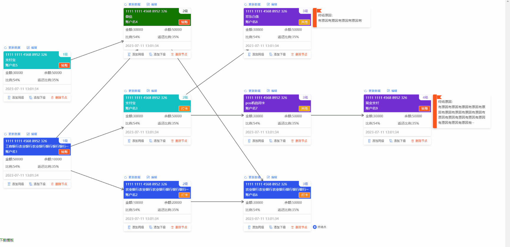
},3.1.5 最终效果
第四章 总结
小编以上的所有说明有耐心看完,能掌握g6大部分基础知识了。整体流程就是节点、边、点与边的关联(会涉及算法)、实例化图配置、最后渲染图数据,跟着改步骤走即可!!!
文章来源:https://blog.csdn.net/qq_45796592/article/details/132637275
本文来自互联网用户投稿,该文观点仅代表作者本人,不代表本站立场。本站仅提供信息存储空间服务,不拥有所有权,不承担相关法律责任。 如若内容造成侵权/违法违规/事实不符,请联系我的编程经验分享网邮箱:veading@qq.com进行投诉反馈,一经查实,立即删除!
本文来自互联网用户投稿,该文观点仅代表作者本人,不代表本站立场。本站仅提供信息存储空间服务,不拥有所有权,不承担相关法律责任。 如若内容造成侵权/违法违规/事实不符,请联系我的编程经验分享网邮箱:veading@qq.com进行投诉反馈,一经查实,立即删除!