WPF组合控件TreeView+DataGrid之DataGrid封装-粉丝专栏
2023-12-22 23:35:33
? ? ? ? wpf的功能非常强大,很多控件都是原生的,但是要使用TreeView+DataGrid的组合,就需要我们自己去封装实现。
我们需要的效果如图所示:


这2个图都是第三方控件自带的,并且都是收费使用。
现在我们就用原生的控件进行封装一个。
本文源码效果截图,(搞了好几天,的确有难度,所以源码也收费,便宜,赚点辛苦费)

功能如上图所示, 目前基本上把常用的样式都实现了
首先说明一下,实现上面的效果,有3种方法
第一种:技术的选择是TreeView。
WPF组合控件TreeView+DataGrid之TreeView封装-粉丝专栏-CSDN博客
第二种:技术的选择是DataGrid(也就是本文的演示)。
第三种:技术的选择是ListView。
本文演示的是DataGrid的实现。
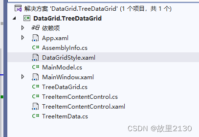
1.首先建立一个wpf程序

2.封装TreeDataGrid.cs
namespace DataGrid.TreeDataGrid
{
    using System.Windows;
    //把引用写在里面
    using System.Windows.Controls;
    public class TreeDataGrid : DataGrid
    {
        protected override DependencyObject GetContainerForItemOverride()
        {
            return new TreeDataGridRow();
        }

        protected override bool IsItemItsOwnContainerOverride(object item)
        {
            return item is TreeDataGridRow;
        }
    }

    public class TreeDataGridRow : DataGridRow
    {

    }
}
3.DataGridStyle.xaml
<ResourceDictionary xmlns="http://schemas.microsoft.com/winfx/2006/xaml/presentation"
                    xmlns:x="http://schemas.microsoft.com/winfx/2006/xaml"
                    xmlns:local="clr-namespace:DataGrid.TreeDataGrid"
                    >
    <!--DataGrid样式-->
    <Style TargetType="{x:Type local:TreeDataGrid}">
        <!--网格线颜色-->
        <Setter Property="CanUserResizeColumns" Value="false"/>
        <Setter Property="Background" Value="#FFF7EDAD" />
        <Setter Property="BorderBrush" Value="#FFF5F7F5" />
        <Setter Property="HorizontalGridLinesBrush">
            <Setter.Value>
                <SolidColorBrush Color="#d6c79b"/>
            </Setter.Value>
        </Setter>
        <Setter Property="VerticalGridLinesBrush">
            <Setter.Value>
                <SolidColorBrush Color="#d6c79b"/>
            </Setter.Value>
        </Setter>
    </Style>

    <!--标题栏样式 DataGridColumnHeader-->
    <Style TargetType="DataGridColumnHeader"  >
        <Setter Property="SnapsToDevicePixels" Value="True" />
        <Setter Property="MinWidth" Value="0" />
        <Setter Property="MinHeight" Value="28" />
        <Setter Property="Foreground" Value="#323433" />
        <Setter Property="FontSize" Value="14" />
        <Setter Property="FontWeight" Value="Bold" />
        <Setter Property="Cursor" Value="Hand" />
        <Setter Property="Template">
            <Setter.Value>
                <ControlTemplate TargetType="DataGridColumnHeader">
                    <Border x:Name="BackgroundBorder" BorderThickness="0,1,0,1"
                             BorderBrush="#e6dbba"
                              Width="Auto">
                        <Grid >
                            <Grid.ColumnDefinitions>
                                <ColumnDefinition Width="*" />
                            </Grid.ColumnDefinitions>
                            <ContentPresenter  Margin="0,0,0,0" VerticalAlignment="Center" HorizontalAlignment="Center"/>
                            <Path x:Name="SortArrow" Visibility="Collapsed" Data="M0,0 L1,0 0.5,1 z" Stretch="Fill"  Grid.Column="2" Width="8" Height="6" Fill="White" Margin="0,0,50,0"
                            VerticalAlignment="Center" RenderTransformOrigin="1,1" />
                            <Rectangle Width="1" Fill="#d6c79b" HorizontalAlignment="Right" Grid.ColumnSpan="1" />
                        </Grid>
                    </Border>
                </ControlTemplate>
            </Setter.Value>
        </Setter>
        <Setter Property="Height" Value="25"/>
    </Style>
    <!--行样式触发-->
    <!--背景色改变必须先设置cellStyle 因为cellStyle会覆盖rowStyle样式-->

    <Style TargetType="local:TreeDataGridRow">
        <Setter Property="Margin" Value="0"/>
        <Setter Property="Padding" Value="0"/>
        <Style.Triggers>
            <DataTrigger Binding="{Binding IsVisible}" Value="False">
                <Setter Property="Visibility" Value="Collapsed"/>
            </DataTrigger>
            <Trigger Property="AlternationIndex" Value="0" >
                <Setter Property="Background" Value="#e7e7e7" />
            </Trigger>
            <Trigger Property="AlternationIndex" Value="1" >
                <Setter Property="Background" Value="#f2f2f2" />
            </Trigger>

            <Trigger Property="IsMouseOver" Value="True">
                <Setter Property="Background" Value="Red"/>
                <!--<Setter Property="Foreground" Value="White"/>-->
            </Trigger>

            <Trigger Property="IsSelected" Value="True">
                <Setter Property="Background" Value="YellowGreen"/>
            </Trigger>
        </Style.Triggers>
    </Style>

    <!--单元格样式触发-->
    <Style TargetType="DataGridCell">
        <Setter Property="Template">
            <Setter.Value>
                <ControlTemplate TargetType="DataGridCell">
                    <TextBlock   VerticalAlignment="Center"  >
                           <ContentPresenter />
                    </TextBlock>
                </ControlTemplate>
            </Setter.Value>
        </Setter>
        <Style.Triggers>
            <Trigger Property="IsSelected" Value="True">
                <Setter Property="Foreground" Value="Red"/>
            </Trigger>
        </Style.Triggers>
    </Style>
</ResourceDictionary>
4.最终源码实例
需要源码请联系我。
本文来源:
文章来源:https://blog.csdn.net/u012563853/article/details/135162721
本文来自互联网用户投稿,该文观点仅代表作者本人,不代表本站立场。本站仅提供信息存储空间服务,不拥有所有权,不承担相关法律责任。 如若内容造成侵权/违法违规/事实不符,请联系我的编程经验分享网邮箱:veading@qq.com进行投诉反馈,一经查实,立即删除!
本文来自互联网用户投稿,该文观点仅代表作者本人,不代表本站立场。本站仅提供信息存储空间服务,不拥有所有权,不承担相关法律责任。 如若内容造成侵权/违法违规/事实不符,请联系我的编程经验分享网邮箱:veading@qq.com进行投诉反馈,一经查实,立即删除!