vue3 封装一个按钮组件(可自定义按钮样式)
2024-01-09 06:28:11
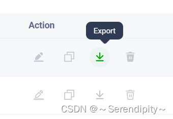
效果图
鼠标悬浮有对应的文字提示,且图标出现背景色和颜色
 ?
?
实现
目前提供五个固定样式的图标及三个用户自定义的图标,可根据需要补充
组件代码
<script setup lang="ts">
import { onMounted, PropType, reactive, ref, watch } from 'vue'
import Tooltip from '@/components/Tooltip/src/Tooltip.vue'
import { useI18n } from 'vue-i18n'

const { t } = useI18n()

enum BtnType {
  edit = 'edit',
  detail = 'detail',
  delete = 'delete',
  permission = 'permission',
  password = 'password',
  custom1 = 'custom1',
  custom2 = 'custom2',
  custom3 = 'custom3'
}

interface BtnAction {
  type: BtnType
  icon?: string | undefined
  color?: string | undefined
  show?: boolean | true
  tooltip?: string | undefined
  disabled?: boolean
  href?: string | undefined
}

const props = defineProps({
  actions: {
    default: () => [],
    type: Array as PropType<BtnAction[]>
  }
})
const _actions = ref(props.actions)
// 监听数据变化
watch(
  () => props.actions,
  (newVal) => {
    _actions.value = newVal
  },
  { deep: true, immediate: true }
)

const getNormalIcon = (action: BtnAction, i: number) => {
  switch (action.type) {
    case BtnType.edit:
      _actions.value[i].tooltip = t('common.edit')
      return 'svg-icon:v2-List-write_line'

    case BtnType.detail:
      _actions.value[i].tooltip = t('queueCalls.details')

      return 'svg-icon:v2-List-Contact_line'
    case BtnType.delete:
      if (!_actions.value[i].tooltip) {
        _actions.value[i].tooltip = t('common.delete')
      }
      return 'svg-icon:v2-List-delete_line'

    case BtnType.permission:
      if (!_actions.value[i].tooltip) {
        _actions.value[i].tooltip = t('manage.user.viewPermissions')
      }
      return 'svg-icon:v2-List-Authority_line'

    case BtnType.password:
      if (!_actions.value[i].tooltip) {
        _actions.value[i].tooltip = t('login.reset.ok')
      }
      return 'svg-icon:v2-List-ResetPassword_line'

    default:
      return action.icon
  }
}

const getActiveIcon = (action: BtnAction) => {
  switch (action.type) {
    case BtnType.edit:
      return 'svg-icon:v2-List-write_face'

    case BtnType.detail:
      return 'svg-icon:v2-List-Contact_face'

    case BtnType.delete:
      return 'svg-icon:v2-List-delete_face'

    case BtnType.permission:
      return 'svg-icon:v2-List-Authority_face'

    case BtnType.password:
      return 'svg-icon:v2-List-ResetPassword_face'

    default:
      return action.icon
  }
}

// 根据类型获取点击事件
const getClick = (type: BtnType) => {
  switch (type) {
    case BtnType.edit:
      return 'click:edit'
    case BtnType.detail:
      return 'click:detail'
    case BtnType.delete:
      return 'click:delete'
    case BtnType.permission:
      return 'click:permission'
    case BtnType.password:
      return 'click:password'
    case BtnType.custom1:
      return 'click:custom1'
    case BtnType.custom2:
      return 'click:custom2'
    case BtnType.custom3:
      return 'click:custom3'
    default:
      return ''
  }
}

const isCustom = (type: BtnType) => {
  return type.indexOf('custom') !== -1
}

// const disableTooltip = (action: BtnAction) => {
//   return action.tooltip === undefined || action.tooltip === ''
// }

onMounted(() => {
  // 如果show为false,移除该按钮
  // _actions.value = props.actions.filter((action) => action.show)
  // console.log('====================', _actions)
})

const emit = defineEmits([
  'click:edit',
  'click:detail',
  'click:delete',
  'click:permission',
  'click:password',
  'click:custom1',
  'click:custom2',
  'click:custom3'
])
</script>

<template>
  <div class="actions flex items-center tooltip-append">
    <div v-for="(action, i) in _actions as BtnAction[]" :key="action.type">
      <Tooltip :title="action.tooltip" :disabled="!action.tooltip">
        <v-btn
          :disabled="action.disabled === undefined ? false : action.disabled"
          v-if="action.show === undefined ? true : action.show"
          :href="action.href"
          target="_blank"
          v-bind="props"
          rounded="xl"
          class="default-btn mr-16px"
          :class="{
            'delete-btn': action.type === 'delete',
            'custom-btn': isCustom(action.type)
          }"
          @click="emit(getClick(action.type))"
          size="32"
          variant="text"
          color="#c6c8cd"
          icon
        >
          <Icon size="21" class="active-icon" :icon="getActiveIcon(action)" />
          <Icon size="21" class="normal-icon" :icon="getNormalIcon(action, i)" />
        </v-btn>
      </Tooltip>
    </div>
  </div>
</template>

<style scoped lang="scss">
.actions {
  .default-btn:hover {
    color: var(--el-color-primary) !important;
    cursor: pointer !important;
  }

  .delete-btn:hover {
    color: #db4b4b !important;
  }

  .custom-btn:hover {
    color: var(--el-color-primary) !important;
  }
}
.tooltip-append {
  .active-icon {
    display: none;
  }
  .normal-icon {
    display: block;
  }
}
.tooltip-append:hover {
  .active-icon {
    display: block;
  }
  .normal-icon {
    display: none;
  }
}
</style>
使用方法
图标数据传一个BtnAction数据格式的数组,使用默认提供的图标,只要一个type字段就可以
click事件根据对应图标类型写@click:[type]
const actions = [
  { type: 'edit' },
  {
    type: 'custom1',
    tooltip: t('common.copy'),
    icon: 'ph:copy'
  },
  {
    type: 'custom2',
    tooltip: t('common.export'),
    icon: 'svg-icon:v2-arrow_download'
  },
  { type: 'delete' }
] as any[]


<ActionBtn
  :actions="actions"
  @click:edit="editFlowTest(row)"
  @click:custom1="copyFlow(row)"
  @click:custom2="exportFlow(row)"
  @click:delete="deleteFlow(row)"
/>
文章来源:https://blog.csdn.net/ZMJ_QQ/article/details/135469472
本文来自互联网用户投稿,该文观点仅代表作者本人,不代表本站立场。本站仅提供信息存储空间服务,不拥有所有权,不承担相关法律责任。 如若内容造成侵权/违法违规/事实不符,请联系我的编程经验分享网邮箱:veading@qq.com进行投诉反馈,一经查实,立即删除!
本文来自互联网用户投稿,该文观点仅代表作者本人,不代表本站立场。本站仅提供信息存储空间服务,不拥有所有权,不承担相关法律责任。 如若内容造成侵权/违法违规/事实不符,请联系我的编程经验分享网邮箱:veading@qq.com进行投诉反馈,一经查实,立即删除!