css3实现类似地图定位循环扩散光圈效果
2023-12-20 06:34:56
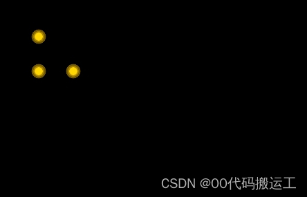
1.效果图,重点opacity,animation,transform:scale
2.html
<div class="icon-warnCom">
        <icon class="icon-warns"><i class="dot"></i><i class="pulse"></i></icon>
    </div>
    <div class="icon-warnCom1">
        <icon class="icon-warns"><i class="dot"></i><i class="pulse"></i></icon>
    </div>
    <div class="icon-warnCom2">
        <icon class="icon-warns"><i class="dot"></i><i class="pulse"></i></icon>
    </div>
3.css
 body {
            width: 100%;
            height: 100%;
            background-color: black;
        }

        @keyframes warn {
            0% {
                transform: scale(0);
                opacity: 0.0;
            }

            25% {
                transform: scale(0);
                opacity: 0.1;
            }

            50% {
                transform: scale(0.1);
                opacity: 0.3;
            }

            75% {
                transform: scale(0.2);
                opacity: 0.5;
            }

            100% {
                transform: scale(0.3);
                opacity: 0.0;
            }
        }

        .icon-warnCom {
            position: absolute;
            width: 12px;
            height: 12px;
            background-color: #ffd803;
            border-radius: 100%;
            top: 100px;
            left: 100px;
        }

        .icon-warns {
            position: relative;
            width: 100%;
            height: 100%;
            display: block;
        }
        /* 保持大小不变的小圆圈  */
        .dot {
            position: absolute;
            left: -44px;
            top: -44px;
            width: 60px;
            height: 60px;
            -webkit-border-radius: 100;
            -moz-border-radius: 100;
            border: 20px solid #f6c100;
            border-radius: 100%;
            z-index: 2;
            opacity: 0;
            -webkit-animation: warn 2.5s ease-out;
            -moz-animation: warn 2.5s ease-out;
            animation: warn 2.5s ease-out;
            -webkit-animation-iteration-count: infinite;
            -moz-animation-iteration-count: infinite;
            animation-iteration-count: infinite;
        }

        /* 产生动画(向外扩散变大)的圆圈  */
        .pulse {
            position: absolute;
            left: -44px;
            top: -44px;
            width: 60px;
            height: 60px;
            border: 20px solid #f6c100;
            -webkit-border-radius: 100%;
            -moz-border-radius: 100%;
            border-radius: 100%;
            z-index: 1;
            opacity: 1;
            -webkit-animation: warn 1.5s ease-out;
            -moz-animation: warn 1.5s ease-out;
            animation: warn 1.5s ease-out;
            -webkit-animation-iteration-count: infinite;
            -moz-animation-iteration-count: infinite;
            animation-iteration-count: infinite;
        }


        .icon-warnCom1 {
            position: absolute;
            width: 12px;
            height: 12px;
            background-color: #ffd803;
            border-radius: 100%;
            top: 50px;
            left: 50px;
        }

        .icon-warnCom2 {
            position: absolute;
            width: 12px;
            height: 12px;
            background-color: #ffd803;
            border-radius: 100%;
            top: 100px;
            left: 50px;
        }
文章来源:https://blog.csdn.net/m0_72929120/article/details/135085877
本文来自互联网用户投稿,该文观点仅代表作者本人,不代表本站立场。本站仅提供信息存储空间服务,不拥有所有权,不承担相关法律责任。 如若内容造成侵权/违法违规/事实不符,请联系我的编程经验分享网邮箱:veading@qq.com进行投诉反馈,一经查实,立即删除!
本文来自互联网用户投稿,该文观点仅代表作者本人,不代表本站立场。本站仅提供信息存储空间服务,不拥有所有权,不承担相关法律责任。 如若内容造成侵权/违法违规/事实不符,请联系我的编程经验分享网邮箱:veading@qq.com进行投诉反馈,一经查实,立即删除!