CSS真的是世界上最神奇的语言~~~
📢 C语言专栏:想学C语言的,冲
📢?VUE专栏:想学VUE的,冲这里
📢 Krpano专栏:想学Krpano的,冲
🔔 上述专栏,都在不定期持续更新中!!!!!!!!!!!!!
目录
?
 ?
?
? 前言
????????你是否曾经想过,为什么网页上的文字、图片、按钮、菜单等元素都能够呈现出各种各样的样式和效果?你是否曾经想过,为什么网页上的布局可以随着屏幕大小的变化而自适应地调整?你是否曾经想过,为什么网页上的动画可以让你眼花缭乱,让你感受到无穷的魅力?
答案就是:CSS。
????????CSS,全称Cascading Style Sheets,中文译为层叠样式表,是一种用来描述网页上的元素如何显示的语言。CSS可以让你控制网页上的字体、颜色、背景、边框、间距、对齐、浮动、定位、过渡、变换、动画等等属性,让你的网页变得美观、动感、交互性强。
CSS是世界上最神奇的语言,没有之一。为什么这么说呢?让我们来看看CSS的一些特点:
- - CSS是一种声明式的语言,也就是说,你只需要告诉浏览器你想要什么样式,而不需要告诉它如何实现。这样,你就可以省去很多复杂的逻辑和代码,让你的开发更加高效和简洁。
- - CSS是一种层叠的语言,也就是说,你可以在不同的地方定义不同的样式,然后让它们按照一定的优先级和规则进行叠加和覆盖。这样,你就可以实现很多复杂的效果,而不需要重复地写很多相同的代码。
- - CSS是一种灵活的语言,也就是说,你可以根据不同的条件和场景来应用不同的样式,比如媒体查询、伪类、伪元素等。这样,你就可以让你的网页适应不同的设备和用户,提高你的网页的可用性和用户体验。
- - CSS是一种有趣的语言,也就是说,你可以用CSS来实现很多你想象不到的效果,比如3D立方体、太阳系、心形图案、动物、人物等等。你甚至可以用CSS来写代码、画画、写诗、玩游戏等等。CSS的可能性是无限的,只要你有创意和想象力。
????????总之,CSS是一种让你的网页变得更加美观、动感、交互性强的语言,也是一种让你的开发变得更加高效、简洁、灵活、有趣的语言。CSS是世界上最神奇的语言,你值得拥有!
? 案例
比如:

是不是很酷,等等还有更酷的
?再比如
 ?
?
不得不承认,这真是太酷了 ?
?
接下来,没有废话直入主题
? 源码
-
第一种效果
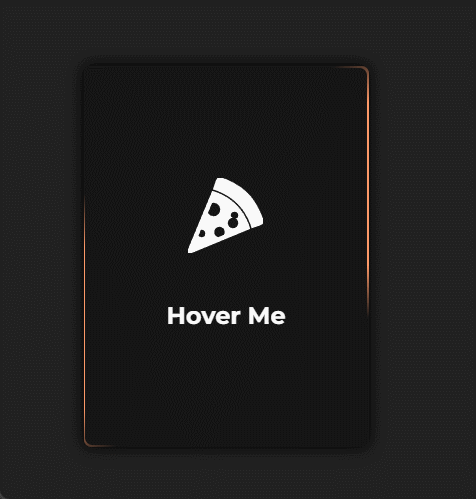
HTML:
<div class="card">
<div class="content">
<div class="back">
<div class="back-content">
<svg stroke="#ffffff" xmlns:xlink="http://www.w3.org/1999/xlink" xmlns="http://www.w3.org/2000/svg" viewBox="0 0 50 50" height="50px" width="50px" fill="#ffffff">
<g stroke-width="0" id="SVGRepo_bgCarrier"></g>
<g stroke-linejoin="round" stroke-linecap="round" id="SVGRepo_tracerCarrier"></g>
<g id="SVGRepo_iconCarrier">
<path d="M20.84375 0.03125C20.191406 0.0703125 19.652344 0.425781 19.21875 1.53125C18.988281 2.117188 18.5 3.558594 18.03125 4.9375C17.792969 5.636719 17.570313 6.273438 17.40625 6.75C17.390625 6.796875 17.414063 6.855469 17.40625 6.90625C17.398438 6.925781 17.351563 6.949219 17.34375 6.96875L17.25 7.25C18.566406 7.65625 19.539063 8.058594 19.625 8.09375C22.597656 9.21875 28.351563 11.847656 33.28125 16.78125C38.5 22 41.183594 28.265625 42.09375 30.71875C42.113281 30.761719 42.375 31.535156 42.75 32.84375C42.757813 32.839844 42.777344 32.847656 42.78125 32.84375C43.34375 32.664063 44.953125 32.09375 46.3125 31.625C47.109375 31.351563 47.808594 31.117188 48.15625 31C49.003906 30.714844 49.542969 30.292969 49.8125 29.6875C50.074219 29.109375 50.066406 28.429688 49.75 27.6875C49.605469 27.347656 49.441406 26.917969 49.25 26.4375C47.878906 23.007813 45.007813 15.882813 39.59375 10.46875C33.613281 4.484375 25.792969 1.210938 22.125 0.21875C21.648438 0.0898438 21.234375 0.0078125 20.84375 0.03125 Z M 16.46875 9.09375L0.0625 48.625C-0.09375 48.996094 -0.00390625 49.433594 0.28125 49.71875C0.472656 49.910156 0.738281 50 1 50C1.128906 50 1.253906 49.988281 1.375 49.9375L40.90625 33.59375C40.523438 32.242188 40.222656 31.449219 40.21875 31.4375C39.351563 29.089844 36.816406 23.128906 31.875 18.1875C27.035156 13.34375 21.167969 10.804688 18.875 9.9375C18.84375 9.925781 17.8125 9.5 16.46875 9.09375 Z M 17 16C19.761719 16 22 18.238281 22 21C22 23.761719 19.761719 26 17 26C15.140625 26 13.550781 24.972656 12.6875 23.46875L15.6875 16.1875C16.101563 16.074219 16.550781 16 17 16 Z M 31 22C32.65625 22 34 23.34375 34 25C34 25.917969 33.585938 26.730469 32.9375 27.28125L32.90625 27.28125C33.570313 27.996094 34 28.949219 34 30C34 32.210938 32.210938 34 30 34C27.789063 34 26 32.210938 26 30C26 28.359375 26.996094 26.960938 28.40625 26.34375L28.3125 26.3125C28.117188 25.917969 28 25.472656 28 25C28 23.34375 29.34375 22 31 22 Z M 21 32C23.210938 32 25 33.789063 25 36C25 36.855469 24.710938 37.660156 24.25 38.3125L20.3125 39.9375C18.429688 39.609375 17 37.976563 17 36C17 33.789063 18.789063 32 21 32 Z M 9 34C10.65625 34 12 35.34375 12 37C12 38.65625 10.65625 40 9 40C7.902344 40 6.960938 39.414063 6.4375 38.53125L8.25 34.09375C8.488281 34.03125 8.742188 34 9 34Z"></path>
</g>
</svg>
<strong>Hover Me</strong>
</div>
</div>
<div class="front">
<div class="img">
<div class="circle">
</div>
<div class="circle" id="right">
</div>
<div class="circle" id="bottom">
</div>
</div>
<div class="front-content">
<small class="badge">Pasta</small>
<div class="description">
<div class="title">
<p class="title">
<strong>Spaguetti Bolognese</strong>
</p>
<svg fill-rule="nonzero" height="15px" width="15px" viewBox="0,0,256,256" xmlns:xlink="http://www.w3.org/1999/xlink" xmlns="http://www.w3.org/2000/svg"><g style="mix-blend-mode: normal" text-anchor="none" font-size="none" font-weight="none" font-family="none" stroke-dashoffset="0" stroke-dasharray="" stroke-miterlimit="10" stroke-linejoin="miter" stroke-linecap="butt" stroke-width="1" stroke="none" fill-rule="nonzero" fill="#20c997"><g transform="scale(8,8)"><path d="M25,27l-9,-6.75l-9,6.75v-23h18z"></path></g></g></svg>
</div>
<p class="card-footer">
30 Mins | 1 Serving
</p>
</div>
</div>
</div>
</div>
</div>CSS:?
.card {
  overflow: visible;
  width: 190px;
  height: 254px;
}

.content {
  width: 100%;
  height: 100%;
  transform-style: preserve-3d;
  transition: transform 300ms;
  box-shadow: 0px 0px 10px 1px #000000ee;
  border-radius: 5px;
}

.front, .back {
  background-color: #151515;
  position: absolute;
  width: 100%;
  height: 100%;
  backface-visibility: hidden;
  -webkit-backface-visibility: hidden;
  border-radius: 5px;
  overflow: hidden;
}

.back {
  width: 100%;
  height: 100%;
  justify-content: center;
  display: flex;
  align-items: center;
  overflow: hidden;
}

.back::before {
  position: absolute;
  content: ' ';
  display: block;
  width: 160px;
  height: 160%;
  background: linear-gradient(90deg, transparent, #ff9966, #ff9966, #ff9966, #ff9966, transparent);
  animation: rotation_481 5000ms infinite linear;
}

.back-content {
  position: absolute;
  width: 99%;
  height: 99%;
  background-color: #151515;
  border-radius: 5px;
  color: white;
  display: flex;
  flex-direction: column;
  justify-content: center;
  align-items: center;
  gap: 30px;
}

.card:hover .content {
  transform: rotateY(180deg);
}

@keyframes rotation_481 {
  0% {
    transform: rotateZ(0deg);
  }

  0% {
    transform: rotateZ(360deg);
  }
}

.front {
  transform: rotateY(180deg);
  color: white;
}

.front .front-content {
  position: absolute;
  width: 100%;
  height: 100%;
  padding: 10px;
  display: flex;
  flex-direction: column;
  justify-content: space-between;
}

.front-content .badge {
  background-color: #00000055;
  padding: 2px 10px;
  border-radius: 10px;
  backdrop-filter: blur(2px);
  width: fit-content;
}

.description {
  box-shadow: 0px 0px 10px 5px #00000088;
  width: 100%;
  padding: 10px;
  background-color: #00000099;
  backdrop-filter: blur(5px);
  border-radius: 5px;
}

.title {
  font-size: 11px;
  max-width: 100%;
  display: flex;
  justify-content: space-between;
}

.title p {
  width: 50%;
}

.card-footer {
  color: #ffffff88;
  margin-top: 5px;
  font-size: 8px;
}

.front .img {
  position: absolute;
  width: 100%;
  height: 100%;
  object-fit: cover;
  object-position: center;
}

.circle {
  width: 90px;
  height: 90px;
  border-radius: 50%;
  background-color: #ffbb66;
  position: relative;
  filter: blur(15px);
  animation: floating 2600ms infinite linear;
}

#bottom {
  background-color: #ff8866;
  left: 50px;
  top: 0px;
  width: 150px;
  height: 150px;
  animation-delay: -800ms;
}

#right {
  background-color: #ff2233;
  left: 160px;
  top: -80px;
  width: 30px;
  height: 30px;
  animation-delay: -1800ms;
}

@keyframes floating {
  0% {
    transform: translateY(0px);
  }

  50% {
    transform: translateY(10px);
  }

  100% {
    transform: translateY(0px);
  }
}-
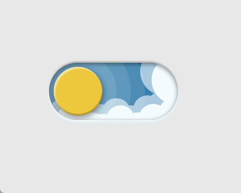
第二种效果

HTML:
<label class="theme-switch">
  <input type="checkbox" class="theme-switch__checkbox">
  <div class="theme-switch__container">
    <div class="theme-switch__clouds"></div>
    <div class="theme-switch__stars-container">
      <svg xmlns="http://www.w3.org/2000/svg" viewBox="0 0 144 55" fill="none">
        <path fill-rule="evenodd" clip-rule="evenodd" d="M135.831 3.00688C135.055 3.85027 134.111 4.29946 133 4.35447C134.111 4.40947 135.055 4.85867 135.831 5.71123C136.607 6.55462 136.996 7.56303 136.996 8.72727C136.996 7.95722 137.172 7.25134 137.525 6.59129C137.886 5.93124 138.372 5.39954 138.98 5.00535C139.598 4.60199 140.268 4.39114 141 4.35447C139.88 4.2903 138.936 3.85027 138.16 3.00688C137.384 2.16348 136.996 1.16425 136.996 0C136.996 1.16425 136.607 2.16348 135.831 3.00688ZM31 23.3545C32.1114 23.2995 33.0551 22.8503 33.8313 22.0069C34.6075 21.1635 34.9956 20.1642 34.9956 19C34.9956 20.1642 35.3837 21.1635 36.1599 22.0069C36.9361 22.8503 37.8798 23.2903 39 23.3545C38.2679 23.3911 37.5976 23.602 36.9802 24.0053C36.3716 24.3995 35.8864 24.9312 35.5248 25.5913C35.172 26.2513 34.9956 26.9572 34.9956 27.7273C34.9956 26.563 34.6075 25.5546 33.8313 24.7112C33.0551 23.8587 32.1114 23.4095 31 23.3545ZM0 36.3545C1.11136 36.2995 2.05513 35.8503 2.83131 35.0069C3.6075 34.1635 3.99559 33.1642 3.99559 32C3.99559 33.1642 4.38368 34.1635 5.15987 35.0069C5.93605 35.8503 6.87982 36.2903 8 36.3545C7.26792 36.3911 6.59757 36.602 5.98015 37.0053C5.37155 37.3995 4.88644 37.9312 4.52481 38.5913C4.172 39.2513 3.99559 39.9572 3.99559 40.7273C3.99559 39.563 3.6075 38.5546 2.83131 37.7112C2.05513 36.8587 1.11136 36.4095 0 36.3545ZM56.8313 24.0069C56.0551 24.8503 55.1114 25.2995 54 25.3545C55.1114 25.4095 56.0551 25.8587 56.8313 26.7112C57.6075 27.5546 57.9956 28.563 57.9956 29.7273C57.9956 28.9572 58.172 28.2513 58.5248 27.5913C58.8864 26.9312 59.3716 26.3995 59.9802 26.0053C60.5976 25.602 61.2679 25.3911 62 25.3545C60.8798 25.2903 59.9361 24.8503 59.1599 24.0069C58.3837 23.1635 57.9956 22.1642 57.9956 21C57.9956 22.1642 57.6075 23.1635 56.8313 24.0069ZM81 25.3545C82.1114 25.2995 83.0551 24.8503 83.8313 24.0069C84.6075 23.1635 84.9956 22.1642 84.9956 21C84.9956 22.1642 85.3837 23.1635 86.1599 24.0069C86.9361 24.8503 87.8798 25.2903 89 25.3545C88.2679 25.3911 87.5976 25.602 86.9802 26.0053C86.3716 26.3995 85.8864 26.9312 85.5248 27.5913C85.172 28.2513 84.9956 28.9572 84.9956 29.7273C84.9956 28.563 84.6075 27.5546 83.8313 26.7112C83.0551 25.8587 82.1114 25.4095 81 25.3545ZM136 36.3545C137.111 36.2995 138.055 35.8503 138.831 35.0069C139.607 34.1635 139.996 33.1642 139.996 32C139.996 33.1642 140.384 34.1635 141.16 35.0069C141.936 35.8503 142.88 36.2903 144 36.3545C143.268 36.3911 142.598 36.602 141.98 37.0053C141.372 37.3995 140.886 37.9312 140.525 38.5913C140.172 39.2513 139.996 39.9572 139.996 40.7273C139.996 39.563 139.607 38.5546 138.831 37.7112C138.055 36.8587 137.111 36.4095 136 36.3545ZM101.831 49.0069C101.055 49.8503 100.111 50.2995 99 50.3545C100.111 50.4095 101.055 50.8587 101.831 51.7112C102.607 52.5546 102.996 53.563 102.996 54.7273C102.996 53.9572 103.172 53.2513 103.525 52.5913C103.886 51.9312 104.372 51.3995 104.98 51.0053C105.598 50.602 106.268 50.3911 107 50.3545C105.88 50.2903 104.936 49.8503 104.16 49.0069C103.384 48.1635 102.996 47.1642 102.996 46C102.996 47.1642 102.607 48.1635 101.831 49.0069Z" fill="currentColor"></path>
      </svg>
    </div>
    <div class="theme-switch__circle-container">
      <div class="theme-switch__sun-moon-container">
        <div class="theme-switch__moon">
          <div class="theme-switch__spot"></div>
          <div class="theme-switch__spot"></div>
          <div class="theme-switch__spot"></div>
        </div>
      </div>
    </div>
  </div>
</label>
CSS:?
.theme-switch {
  --toggle-size: 30px;
  /* the size is adjusted using font-size,
     this is not transform scale,
     so you can choose any size */
  --container-width: 5.625em;
  --container-height: 2.5em;
  --container-radius: 6.25em;
  /* radius 0 - minecraft mode :) */
  --container-light-bg: #3D7EAE;
  --container-night-bg: #1D1F2C;
  --circle-container-diameter: 3.375em;
  --sun-moon-diameter: 2.125em;
  --sun-bg: #ECCA2F;
  --moon-bg: #C4C9D1;
  --spot-color: #959DB1;
  --circle-container-offset: calc((var(--circle-container-diameter) - var(--container-height)) / 2 * -1);
  --stars-color: #fff;
  --clouds-color: #F3FDFF;
  --back-clouds-color: #AACADF;
  --transition: .5s cubic-bezier(0, -0.02, 0.4, 1.25);
  --circle-transition: .3s cubic-bezier(0, -0.02, 0.35, 1.17);
}

.theme-switch, .theme-switch *, .theme-switch *::before, .theme-switch *::after {
  -webkit-box-sizing: border-box;
  box-sizing: border-box;
  margin: 0;
  padding: 0;
  font-size: var(--toggle-size);
}

.theme-switch__container {
  width: var(--container-width);
  height: var(--container-height);
  background-color: var(--container-light-bg);
  border-radius: var(--container-radius);
  overflow: hidden;
  cursor: pointer;
  -webkit-box-shadow: 0em -0.062em 0.062em rgba(0, 0, 0, 0.25), 0em 0.062em 0.125em rgba(255, 255, 255, 0.94);
  box-shadow: 0em -0.062em 0.062em rgba(0, 0, 0, 0.25), 0em 0.062em 0.125em rgba(255, 255, 255, 0.94);
  -webkit-transition: var(--transition);
  -o-transition: var(--transition);
  transition: var(--transition);
  position: relative;
}

.theme-switch__container::before {
  content: "";
  position: absolute;
  z-index: 1;
  inset: 0;
  -webkit-box-shadow: 0em 0.05em 0.187em rgba(0, 0, 0, 0.25) inset, 0em 0.05em 0.187em rgba(0, 0, 0, 0.25) inset;
  box-shadow: 0em 0.05em 0.187em rgba(0, 0, 0, 0.25) inset, 0em 0.05em 0.187em rgba(0, 0, 0, 0.25) inset;
  border-radius: var(--container-radius)
}

.theme-switch__checkbox {
  display: none;
}

.theme-switch__circle-container {
  width: var(--circle-container-diameter);
  height: var(--circle-container-diameter);
  background-color: rgba(255, 255, 255, 0.1);
  position: absolute;
  left: var(--circle-container-offset);
  top: var(--circle-container-offset);
  border-radius: var(--container-radius);
  -webkit-box-shadow: inset 0 0 0 3.375em rgba(255, 255, 255, 0.1), inset 0 0 0 3.375em rgba(255, 255, 255, 0.1), 0 0 0 0.625em rgba(255, 255, 255, 0.1), 0 0 0 1.25em rgba(255, 255, 255, 0.1);
  box-shadow: inset 0 0 0 3.375em rgba(255, 255, 255, 0.1), inset 0 0 0 3.375em rgba(255, 255, 255, 0.1), 0 0 0 0.625em rgba(255, 255, 255, 0.1), 0 0 0 1.25em rgba(255, 255, 255, 0.1);
  display: -webkit-box;
  display: -ms-flexbox;
  display: flex;
  -webkit-transition: var(--circle-transition);
  -o-transition: var(--circle-transition);
  transition: var(--circle-transition);
  pointer-events: none;
}

.theme-switch__sun-moon-container {
  pointer-events: auto;
  position: relative;
  z-index: 2;
  width: var(--sun-moon-diameter);
  height: var(--sun-moon-diameter);
  margin: auto;
  border-radius: var(--container-radius);
  background-color: var(--sun-bg);
  -webkit-box-shadow: 0.062em 0.062em 0.062em 0em rgba(254, 255, 239, 0.61) inset, 0em -0.062em 0.062em 0em #a1872a inset;
  box-shadow: 0.062em 0.062em 0.062em 0em rgba(254, 255, 239, 0.61) inset, 0em -0.062em 0.062em 0em #a1872a inset;
  -webkit-filter: drop-shadow(0.062em 0.125em 0.125em rgba(0, 0, 0, 0.25)) drop-shadow(0em 0.062em 0.125em rgba(0, 0, 0, 0.25));
  filter: drop-shadow(0.062em 0.125em 0.125em rgba(0, 0, 0, 0.25)) drop-shadow(0em 0.062em 0.125em rgba(0, 0, 0, 0.25));
  overflow: hidden;
  -webkit-transition: var(--transition);
  -o-transition: var(--transition);
  transition: var(--transition);
}

.theme-switch__moon {
  -webkit-transform: translateX(100%);
  -ms-transform: translateX(100%);
  transform: translateX(100%);
  width: 100%;
  height: 100%;
  background-color: var(--moon-bg);
  border-radius: inherit;
  -webkit-box-shadow: 0.062em 0.062em 0.062em 0em rgba(254, 255, 239, 0.61) inset, 0em -0.062em 0.062em 0em #969696 inset;
  box-shadow: 0.062em 0.062em 0.062em 0em rgba(254, 255, 239, 0.61) inset, 0em -0.062em 0.062em 0em #969696 inset;
  -webkit-transition: var(--transition);
  -o-transition: var(--transition);
  transition: var(--transition);
  position: relative;
}

.theme-switch__spot {
  position: absolute;
  top: 0.75em;
  left: 0.312em;
  width: 0.75em;
  height: 0.75em;
  border-radius: var(--container-radius);
  background-color: var(--spot-color);
  -webkit-box-shadow: 0em 0.0312em 0.062em rgba(0, 0, 0, 0.25) inset;
  box-shadow: 0em 0.0312em 0.062em rgba(0, 0, 0, 0.25) inset;
}

.theme-switch__spot:nth-of-type(2) {
  width: 0.375em;
  height: 0.375em;
  top: 0.937em;
  left: 1.375em;
}

.theme-switch__spot:nth-last-of-type(3) {
  width: 0.25em;
  height: 0.25em;
  top: 0.312em;
  left: 0.812em;
}

.theme-switch__clouds {
  width: 1.25em;
  height: 1.25em;
  background-color: var(--clouds-color);
  border-radius: var(--container-radius);
  position: absolute;
  bottom: -0.625em;
  left: 0.312em;
  -webkit-box-shadow: 0.937em 0.312em var(--clouds-color), -0.312em -0.312em var(--back-clouds-color), 1.437em 0.375em var(--clouds-color), 0.5em -0.125em var(--back-clouds-color), 2.187em 0 var(--clouds-color), 1.25em -0.062em var(--back-clouds-color), 2.937em 0.312em var(--clouds-color), 2em -0.312em var(--back-clouds-color), 3.625em -0.062em var(--clouds-color), 2.625em 0em var(--back-clouds-color), 4.5em -0.312em var(--clouds-color), 3.375em -0.437em var(--back-clouds-color), 4.625em -1.75em 0 0.437em var(--clouds-color), 4em -0.625em var(--back-clouds-color), 4.125em -2.125em 0 0.437em var(--back-clouds-color);
  box-shadow: 0.937em 0.312em var(--clouds-color), -0.312em -0.312em var(--back-clouds-color), 1.437em 0.375em var(--clouds-color), 0.5em -0.125em var(--back-clouds-color), 2.187em 0 var(--clouds-color), 1.25em -0.062em var(--back-clouds-color), 2.937em 0.312em var(--clouds-color), 2em -0.312em var(--back-clouds-color), 3.625em -0.062em var(--clouds-color), 2.625em 0em var(--back-clouds-color), 4.5em -0.312em var(--clouds-color), 3.375em -0.437em var(--back-clouds-color), 4.625em -1.75em 0 0.437em var(--clouds-color), 4em -0.625em var(--back-clouds-color), 4.125em -2.125em 0 0.437em var(--back-clouds-color);
  -webkit-transition: 0.5s cubic-bezier(0, -0.02, 0.4, 1.25);
  -o-transition: 0.5s cubic-bezier(0, -0.02, 0.4, 1.25);
  transition: 0.5s cubic-bezier(0, -0.02, 0.4, 1.25);
}

.theme-switch__stars-container {
  position: absolute;
  color: var(--stars-color);
  top: -100%;
  left: 0.312em;
  width: 2.75em;
  height: auto;
  -webkit-transition: var(--transition);
  -o-transition: var(--transition);
  transition: var(--transition);
}

/* actions */

.theme-switch__checkbox:checked + .theme-switch__container {
  background-color: var(--container-night-bg);
}

.theme-switch__checkbox:checked + .theme-switch__container .theme-switch__circle-container {
  left: calc(100% - var(--circle-container-offset) - var(--circle-container-diameter));
}

.theme-switch__checkbox:checked + .theme-switch__container .theme-switch__circle-container:hover {
  left: calc(100% - var(--circle-container-offset) - var(--circle-container-diameter) - 0.187em)
}

.theme-switch__circle-container:hover {
  left: calc(var(--circle-container-offset) + 0.187em);
}

.theme-switch__checkbox:checked + .theme-switch__container .theme-switch__moon {
  -webkit-transform: translate(0);
  -ms-transform: translate(0);
  transform: translate(0);
}

.theme-switch__checkbox:checked + .theme-switch__container .theme-switch__clouds {
  bottom: -4.062em;
}

.theme-switch__checkbox:checked + .theme-switch__container .theme-switch__stars-container {
  top: 50%;
  -webkit-transform: translateY(-50%);
  -ms-transform: translateY(-50%);
  transform: translateY(-50%);
}-
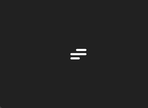
第三种效果

HTML:
<label class="hamburger">
  <input type="checkbox">
  <svg viewBox="0 0 32 32">
    <path class="line line-top-bottom" d="M27 10 13 10C10.8 10 9 8.2 9 6 9 3.5 10.8 2 13 2 15.2 2 17 3.8 17 6L17 26C17 28.2 18.8 30 21 30 23.2 30 25 28.2 25 26 25 23.8 23.2 22 21 22L7 22"></path>
    <path class="line" d="M7 16 27 16"></path>
  </svg>
</label>
CSS:?
.hamburger {
  cursor: pointer;
}

.hamburger input {
  display: none;
}

.hamburger svg {
  /* The size of the SVG defines the overall size */
  height: 3em;
  /* Define the transition for transforming the SVG */
  transition: transform 600ms cubic-bezier(0.4, 0, 0.2, 1);
}

.line {
  fill: none;
  stroke: white;
  stroke-linecap: round;
  stroke-linejoin: round;
  stroke-width: 3;
  /* Define the transition for transforming the Stroke */
  transition: stroke-dasharray 600ms cubic-bezier(0.4, 0, 0.2, 1),
              stroke-dashoffset 600ms cubic-bezier(0.4, 0, 0.2, 1);
}

.line-top-bottom {
  stroke-dasharray: 12 63;
}

.hamburger input:checked + svg {
  transform: rotate(-45deg);
}

.hamburger input:checked + svg .line-top-bottom {
  stroke-dasharray: 20 300;
  stroke-dashoffset: -32.42;
}
-
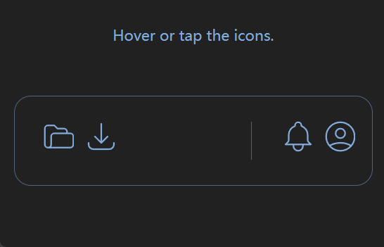
第四种效果

HTML:
<div class="container">
  <div id="wrapper">
    <header>
      <div class="iconDiv" tabindex="0">
        <div class="iconSVG">
          <svg
            xmlns="http://www.w3.org/2000/svg"
            class="h-6 w-6"
            fill="none"
            viewBox="0 0 24 24"
            stroke="currentColor"
            stroke-width="1"
          >
            <path
              stroke-linecap="round"
              stroke-linejoin="round"
              d="M5 19a2 2 0 01-2-2V7a2 2 0 012-2h4l2 2h4a2 2 0 012 2v1M5 19h14a2 2 0 002-2v-5a2 2 0 00-2-2H9a2 2 0 00-2 2v5a2 2 0 01-2 2z"
            ></path>
          </svg>
        </div>
        <span class="text">Load File</span>
      </div>
      <div class="iconDiv" tabindex="0">
        <div class="iconSVG">
          <svg
            xmlns="http://www.w3.org/2000/svg"
            class="h-6 w-6"
            fill="none"
            viewBox="0 0 24 24"
            stroke="currentColor"
            stroke-width="1"
          >
            <path
              stroke-linecap="round"
              stroke-linejoin="round"
              d="M4 16v1a3 3 0 003 3h10a3 3 0 003-3v-1m-4-4l-4 4m0 0l-4-4m4 4V4"
            ></path>
          </svg>
        </div>
        <span class="text">Download</span>
      </div>
      <div class="spacer"></div>
      <div class="divider"></div>
      <div class="iconDiv" tabindex="0">
        <div class="iconSVG">
          <svg
            xmlns="http://www.w3.org/2000/svg"
            class="h-6 w-6"
            fill="none"
            viewBox="0 0 24 24"
            stroke="currentColor"
            stroke-width="1"
          >
            <path
              stroke-linecap="round"
              stroke-linejoin="round"
              d="M15 17h5l-1.405-1.405A2.032 2.032 0 0118 14.158V11a6.002 6.002 0 00-4-5.659V5a2 2 0 10-4 0v.341C7.67 6.165 6 8.388 6 11v3.159c0 .538-.214 1.055-.595 1.436L4 17h5m6 0v1a3 3 0 11-6 0v-1m6 0H9"
            ></path>
          </svg>
        </div>
        <span class="text">Notifications</span>
      </div>
      <div class="iconDiv" tabindex="0">
        <div class="iconSVG">
          <svg
            xmlns="http://www.w3.org/2000/svg"
            class="h-6 w-6"
            fill="none"
            viewBox="0 0 24 24"
            stroke="currentColor"
            stroke-width="1"
          >
            <path
              stroke-linecap="round"
              stroke-linejoin="round"
              d="M5.121 17.804A13.937 13.937 0 0112 16c2.5 0 4.847.655 6.879 1.804M15 10a3 3 0 11-6 0 3 3 0 016 0zm6 2a9 9 0 11-18 0 9 9 0 0118 0z"
            ></path>
          </svg>
        </div>
        <span class="text">Log out </span>
      </div>
    </header>
  </div>
</div>
CSS:
.container {
  background-color: black;
  color: rgb(132, 170, 218);
  font-family: "Inter", sans-serif;
  font-size: 14px;
}
.container::before {
  content: "Hover or tap the icons.";
  font-size: 14px;
  position: absolute;
  left: 50%;
  top: calc(50% - 100px);
  transform: translate(-50%, -50%);
}
.container::after {
  position: absolute;
  bottom: 36px;
  right: 36px;
}
#wrapper {
  display: flex;
  align-items: center;
  justify-content: center;
  position: absolute;
  inset: 0;
}
header {
  width: 340px;
  padding: 0 16px;
  display: flex;
  border: 1px solid rgb(83, 100, 124);
  border-radius: 16px;
}
.iconDiv {
  height: 36px;
  width: 36px;
  margin-top: 20px;
  margin-bottom: 20px;
  margin-left: 4px;
  padding: 4px;
  border-radius: 8px;
  display: inline-flex;
  align-items: center;
  white-space: nowrap;
  overflow: hidden;
  cursor: pointer;
  transition: width 300ms ease-in-out 0s, background-color 300ms linear 200ms;
}
.iconSVG {
  height: 36px;
  aspect-ratio: 1 / 1;
}
.iconDiv:hover,
.iconDiv:focus-visible {
  width: 142px;
  background-color: rgb(34, 52, 77);
  transition: width 300ms ease-in-out 0s, background-color 100ms linear 0s;
}
.iconDiv:focus-visible {
  outline: 1px solid rgb(34, 52, 77);
  outline-offset: 4px;
}
.iconDiv:active {
  opacity: 0.9;
}
.iconDiv::after {
  content: attr(tooltip);
  margin-left: 12px;
  animation: fadeIn 600ms linear forwards;
}
.spacer {
  flex-grow: 1;
}
.divider {
  height: 36px;
  width: 1px;
  margin: 24px 18px;
  background-color: rgb(83, 100, 124);
}

@keyframes fadeIn {
  0% {
    opacity: 0;
  }
  50% {
    opacity: 0;
  }
  100% {
    opacity: 1;
  }
}
.text {
  padding-left: 10px;
}
🙌 结语
????????如果你还没有开始学习CSS,那么你一定要赶快行动起来,因为你会发现CSS是一种让你的网页设计和开发变得更加有趣和有意义的语言。如果你已经开始学习CSS,那么你一定要继续探索和实践,因为你会发现CSS是一种让你的网页效果和功能变得更加丰富和强大的语言。无论你是初学者还是高手,CSS都会给你带来无尽的惊喜和乐趣,让你的网页成为你的艺术品和玩具。CSS是世界上最神奇的语言,你一定不会后悔选择它!
? ? ? ? 我们改日再见!
本文来自互联网用户投稿,该文观点仅代表作者本人,不代表本站立场。本站仅提供信息存储空间服务,不拥有所有权,不承担相关法律责任。 如若内容造成侵权/违法违规/事实不符,请联系我的编程经验分享网邮箱:veading@qq.com进行投诉反馈,一经查实,立即删除!