Matplotlib 绘制基本的图表
2023-12-26 16:38:45
# 导入包
import pandas as pd
import numpy as np
import matplotlib.pyplot as plt
plt.rcParams['font.sans-serif']=['SimHei'] # 用来显示中文
plt.rcParams['axes.unicode_minus'] = False # 显示负坐标轴

# 读取源数据,后续大部分数据基于词文件的数据,需要对金额进行一些简单的处理
file_path = r"D:\data\datasource\data_wuliu.csv"
df1 = pd.read_csv(file_path,parse_dates=['销售时间','交货时间'],encoding='gbk')

# 因销售金额单位的问题,对销售金额列进行处理
# replace ',' with '.'  并将格式转换为float;如果是万元 *10000
def data_deal(number):
    if number.find('万元') !=-1:
        num1 = float(number[:number.find('万元')].replace(',',''))*10000
    else: #找到带元的,删除元,replace ',' with '.'
        num1 = float(number[:number.find('元')].replace(',',''))
    return num1
df1['销售金额'] = df1['销售金额'].map(data_deal)

# 1: 柱形图
# 准备数据,月销售额
df_month = df1.groupby(df1.销售时间.dt.month)['销售金额'].sum().reset_index()

# 画图
plt.bar(df_month.销售时间,df_month['销售金额'],label='销售金额')
plt.legend(loc = 'upper right') # 显示图例
plt.xlabel('月份') # 设置行坐标轴
plt.ylabel('销量') # 设置列坐标轴
plt.xticks(df_month.销售时间 , rotation=45) # 设置x刻度倾斜45度
plt.ylim(0,100000000) #设置坐标轴长度

plt.title('月度销售额',fontsize=16,fontweight='bold') # 设置图标的标题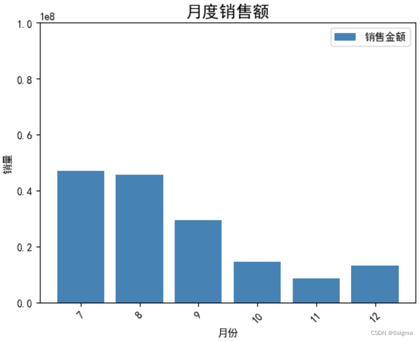
# 2: 条形图
plt.bar(x=0, bottom=df_month.销售时间, height=0.5, width=df_month.销售金额, orientation='horizontal',color='GREEN')
plt.xlabel('销量')
plt.ylabel('月份')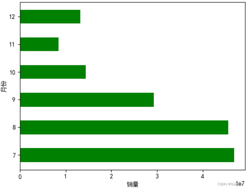
# 分组柱形图: 不同月份中 , 拒货,返修,质量合格的产品数量
# 准备数据
df_pivot = pd.pivot_table(df1,values='订单号',index= df1.销售时间.dt.month,aggfunc = 'count',columns = '货品用户反馈').reset_index()

# 画图
bar1 = plt.bar(x=df_pivot.销售时间-0.2, height=df_pivot.拒货, color='blue', width=0.2,label='拒货',alpha = 0.5) # alpha 设置透明度
bar2 = plt.bar(x=df_pivot.销售时间,height = df_pivot.质量合格, color='green',width=0.2,label='质量合格',alpha = 0.5)
bar3 = plt.bar(x=df_pivot.销售时间+0.2,height = df_pivot.返修, color='red',width=0.2,label='返修',alpha = 0.5)
plt.legend()

# 添加数据标注,
plt.bar_label(bar1)
plt.bar_label(bar2)
plt.bar_label(bar3)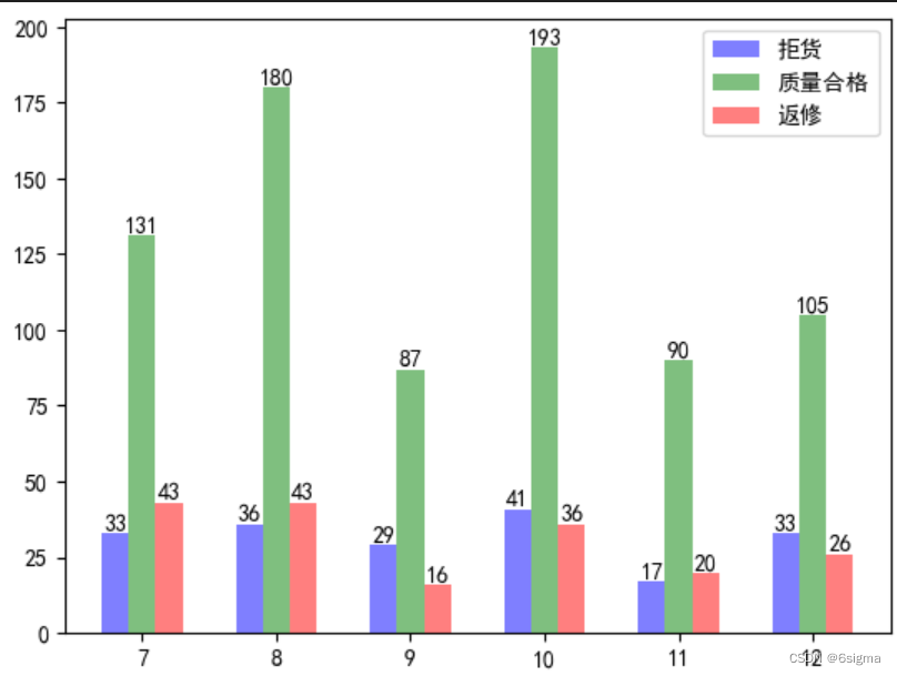
# 堆积柱形图: 不同月份拒货,返修,质量合格的产品数量
bar1 = plt.bar(np.arange(6),df_pivot.拒货,color='red',label='拒货',width=0.5,alpha=0.5)
bar2 =plt.bar(np.arange(6),df_pivot.质量合格,color='blue',label='质量合格',bottom=df_pivot.拒货,width=0.5,alpha=0.5)
bar3 =plt.bar(np.arange(6),df_pivot.返修,color='green',label='返修',bottom=df_pivot.质量合格+df_pivot.拒货,width=0.5,alpha=0.5)

plt.bar_label(bar1,color='white')
plt.bar_label(bar2,color='white')
plt.bar_label(bar3)
# 设置x轴标签
plt.xticks(np.arange(6),df_pivot.销售时间)
plt.ylim(0,400) # 修改刻度
plt.legend(loc='upper right',ncol=3) # 显示图例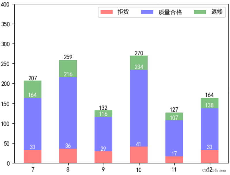
# 5: 堆积条形图
bar1 = plt.bar(x=0,bottom=df_pivot.销售时间,height=0.5, width=df_pivot.拒货, orientation='horizontal',color='GREEN',alpha=0.6)
bar2 = plt.bar(x=df_pivot.拒货,bottom=df_pivot.销售时间,height=0.5, width=df_pivot.质量合格, orientation='horizontal',color='red',alpha=0.6)
bar3 = plt.bar(x=df_pivot.拒货+df_pivot.质量合格,bottom=df_pivot.销售时间,height=0.5, width=df_pivot.返修, orientation='horizontal',color='blue',alpha=0.6)

plt.bar_label(bar1)
plt.bar_label(bar2)
plt.bar_label(bar3)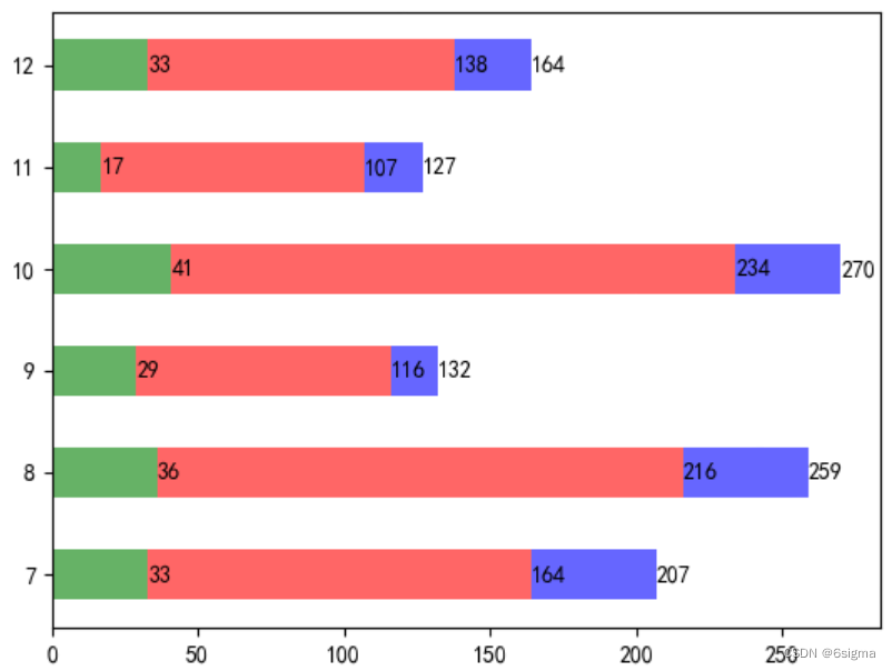
# 6: 饼图: 不同月份拒货,返修的占比,
# 参数 autopct 显示百分比
# explode : 设置炸裂效果,
# startangle=90  : 设置开始画图的角度
# wedgeprops=dict(width=0.4,edgecolor='blue') 设置width 则会生成圆环图,edgecolor='blue' 边线的颜色

plt.figure(figsize=(6,6)) # 设置画布的大小
plt.pie(x=df_pivot.拒货,labels=tuple(df_pivot.销售时间), explode=(0,0.2,0,0,0,0),autopct='%.2f%%',startangle=90,wedgeprops=dict(width=0.4,edgecolor='blue'))
# plt.pie(x=df_pivot.返修,radius=0.5)
# plt.pie(x=df_pivot.拒货,radius=0.5,colors=['white','white','white','white','white','white'],startangle=90,)
plt.legend()
# plt.savefig(r'c:/test.png',dpi=500) # dpi 用来设置像素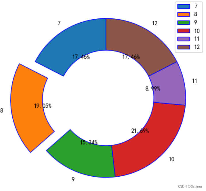
# 7: 折线图
plt.figure(figsize=(10,6))
plt.plot(df_pivot.销售时间,df_pivot.拒货,color='r',marker='.',ms=5,label='拒货')
plt.plot(df_pivot.销售时间,df_pivot.返修,color='b',marker='.',ms=5,label='返修')

# 添加数据标签
for x,y in zip(df_pivot.销售时间,df_pivot.拒货):
    plt.text(x, y+0.5 ,str(y))
for x,y in zip(df_pivot.销售时间,df_pivot.返修):
    plt.text(x, y+0.5 ,str(y))
plt.legend() # 显示图例
plt.title('月度趋势图',fontsize=14)# 添加标题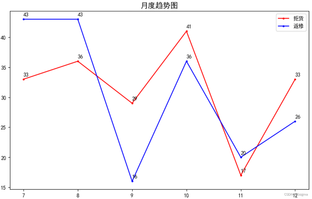
# 当需要在同一个画图上添加多个子图时,方法如下:
# 画布和子图 方法1
fig = plt.figure(figsize=(12,8),dpi=300,facecolor='white') # 设置画布 facecolor 设置画布背景色

# 添加图1:
figure1 = fig.add_subplot(221)
plt.plot(df_pivot.销售时间,df_pivot.拒货,marker='.',label='拒货')

# 添加图2:柱形图,并添加均值线
figure2 = fig.add_subplot(222)
plt.bar(df_pivot.销售时间, df_pivot.拒货,label='拒货')
mean_num = np.mean(df_pivot.拒货)
plt.axhline(y=mean_num,color='r', linestyle=':')

# 添加图3:饼图
figure3 = fig.add_subplot(223)
plt.pie(x=df_pivot.拒货,labels=tuple(df_pivot.销售时间), explode=(0,0.2,0,0,0,0),autopct='%.2f%%',startangle=90)

# 添加图4:堆积柱形图
figure4 = fig.add_subplot(224)
bar1 = plt.bar(np.arange(6),df_pivot.拒货,color='red',label='拒货',width=0.5)
bar2 =plt.bar(np.arange(6),df_pivot.质量合格,color='blue',label='质量合格',bottom=df_pivot.拒货,width=0.5)
bar3 =plt.bar(np.arange(6),df_pivot.返修,color='green',label='返修',bottom=df_pivot.质量合格+df_pivot.拒货,width=0.5)
#显示数据标签
plt.bar_label(bar1,color='white')
plt.bar_label(bar2,color='white')
plt.bar_label(bar3)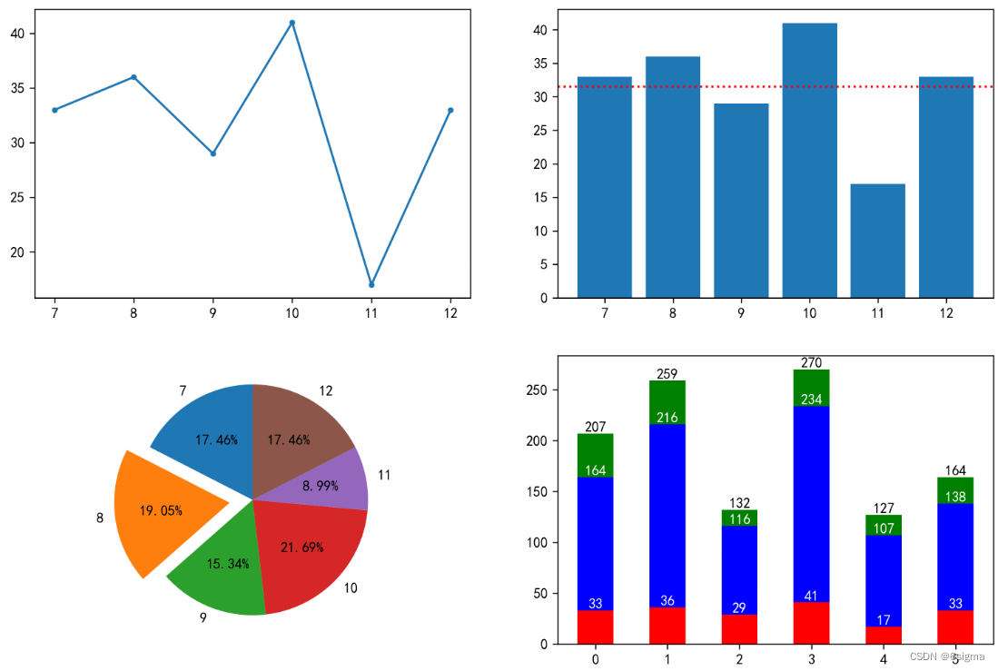
# 画布和子图 方法2
fig,ax = plt.subplots(2,2,figsize=(12,8))

fig1 = ax[0,0]
fig2 = ax[0,1]
fig3 = ax[1,0]
fig4 = ax[1,1]

fig1.bar(df_pivot.销售时间,df_pivot.拒货)
fig2.pie(x=df_pivot.拒货,labels=tuple(df_pivot.销售时间))
fig3.plot(df_pivot.销售时间,df_pivot.拒货,marker='.')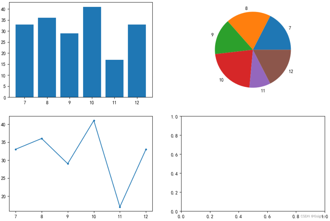
# 大图与子区域
# 设置大图
fig = plt.figure()
left,bottom,width,height = 0.1,0.1,0.8,0.8 # 设置图距离画布边缘的距离
fig1 = fig.add_axes([left,bottom,width,height ])
fig1.bar(df_pivot.销售时间,df_pivot.拒货)
fig1.set_title('拒货分布')

# 设置子图设置位置参数
left,bottom,width,height = 0.65,0.65,0.25,0.2
fig2 = fig.add_subplot([left,bottom,width,height ])
fig2.plot(df_pivot.销售时间,df_pivot.拒货,marker='.')
fig2.set_title('趋势图')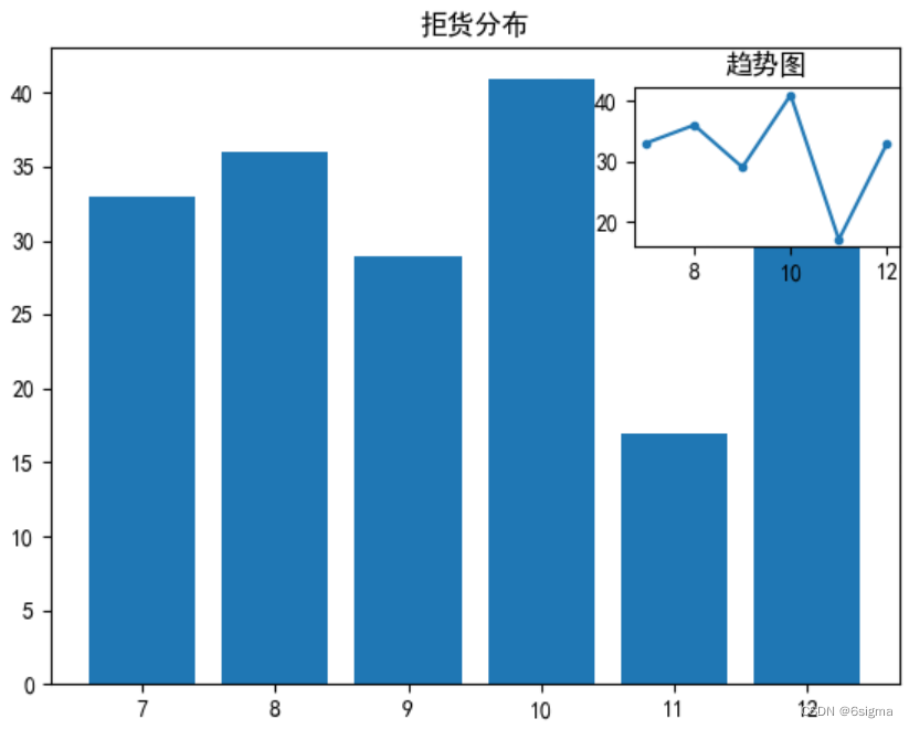
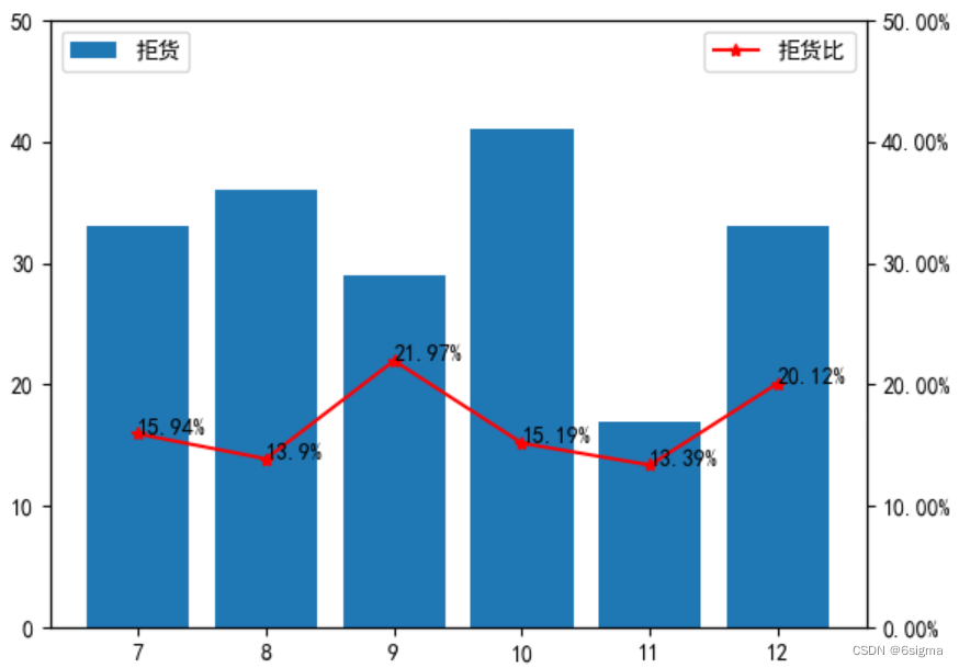
# 8: 折线图与柱形图组合图: 不同月份的拒货数量,以及拒货占比
# 准备数据
df_pivot['拒货比'] = df_pivot['拒货']/(df_pivot['拒货']+df_pivot['质量合格']+df_pivot['返修'])


fig = plt.figure() # 画布
fig1 = fig.add_subplot(111) # 添加子图
fig1.bar(df_pivot.销售时间,df_pivot.拒货,label ='拒货')
fig1.set_ylim(0,50)
fig1.legend(loc = 'upper left')

import matplotlib.ticker as ticker # 用来设置轴标签百分比
fig2=fig1.twinx() # 图2共享图1x轴
fig2.plot(df_pivot.销售时间,df_pivot.拒货比,marker='*', c='r',label='拒货比')
# 设置百分比
pct = ticker.PercentFormatter(1,2) # 0.3设定到30%, 2 代表小数保留2位
fig2.yaxis.set_major_formatter(pct)
fig2.set_ylim(0,0.5)
for x,y in zip(df_pivot.销售时间,df_pivot.拒货比):
    plt.text(x,y,str(round(y*100,2))+'%')
fig2.legend()
# 9: 散点图
plt.scatter(df1.数量,df1.销售金额,c='b',marker='o',alpha=0.6,linewidths=2)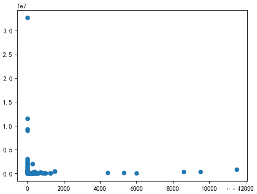
# 10: 直方图
plt.hist(df1.销售金额, bins=50, edgecolor='w')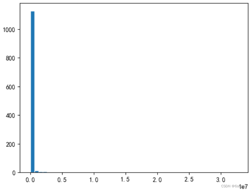
#  11: 面积图:先化折线图,再填充

plt.plot(df_pivot.销售时间, df_pivot.拒货)
plt.plot(df_pivot.销售时间, df_pivot.质量合格)

plt.fill_between(df_pivot.销售时间,0,df_pivot.拒货,facecolor='r',alpha=0.3)
plt.fill_between(df_pivot.销售时间,df_pivot.拒货,df_pivot.质量合格,facecolor='g',alpha=0.3)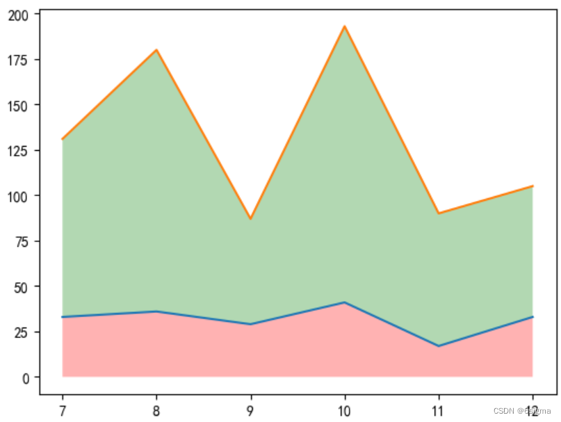
# 12: 雷达图
#  np.pi 是180°


#准备数据
df= pd.DataFrame({'name':['A01','A01','A01','A01','A01','A02','A02','A02','A02','A02'],'course':['数学','语文','英语','物理','化学','数学','语文','英语','物理','化学'],'grade':[75,40,79,91,55,57,68,36,89,70]})
df.set_index('name',inplace=True)
query1 = "name=='A01'"
query2 = "name=='A02'"
A01 = df.query(query1)['grade']
# 创建角度
polar_angle = np.linspace(0,2*np.pi,len(A01),endpoint=False)
polar_angle = np.concatenate((polar_angle,[polar_angle[0]])) # 角度数据也需要首尾相连
A01 = np.concatenate((A01,[A01[0]])) # 雷达图需要首尾连接,所以第一个数据需要重复
A02 = df.query(query2)['grade']
A02 = np.concatenate((A02,[A02[0]]))
course = df.query(query1)['course']
course = np.concatenate((course,[course[0]]))
plt.style.use("ggplot") # 设置画布的样式,
# 可以使用如下代码查看现有的画图样式,类似于PBI 的风格设置,尝试不同样式的效果,选择合适的。
#print(plt.style.available)

fig = plt.figure() # 设置画布
fig1 = fig.add_subplot(111,polar =True)
fig1.plot(polar_angle,A01,'o-',label='A01')
fig1.plot(polar_angle,A02,'o-',label='A02')

fig1.fill(polar_angle,A01,'r',alpha=0.25) # 填充颜色
fig1.fill(polar_angle,A02,'b',alpha=0.25)
plt.legend()
fig1.set_thetagrids(polar_angle*180/np.pi,course)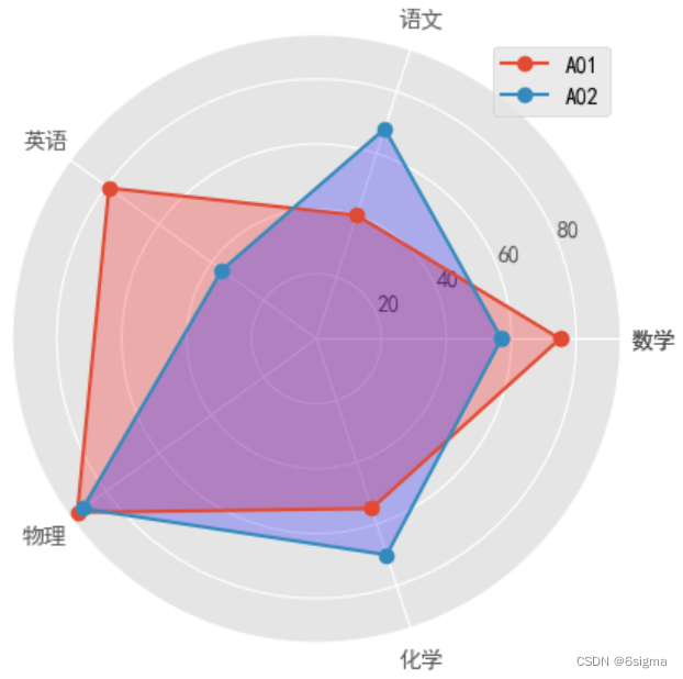
# 13: 瀑布图
# 准备数据
df = pd.DataFrame({'dt':['2020-1-01','2020-1-02','2020-1-03','2020-1-04','2020-1-05','2020-1-06','2020-1-07','2020-1-08'],'amount':[21,18,-10,19,16,-12,13,16]})

plt.style.use('ggplot')
# : x 轴先以index 的方式进行,最后替换为日期
xax = np.arange(len(df.amount))
# print(xax)
height = 0
for i in df.amount.index:
    x = xax[i]
    y = df.amount[i]
    if y >=0:
        plt.bar(x,y,0.8,align='center',bottom=height,label='盈利',color='r' )
    else:
        plt.bar(x,y,0.8,align='center',bottom=height,label='亏损',color='g' )
    # 调整柱形图的高度
    height = height + y
    # 调整x轴的位置
    x = x + 0.8
plt.gca().yaxis.grid(True,linestyle='--',alpha=0.25,color='grey')
plt.gca().xaxis.grid(False)
plt.xticks(np.arange(len(df['dt'])),df.dt,rotation=45) # 将x 轴坐标替换为日期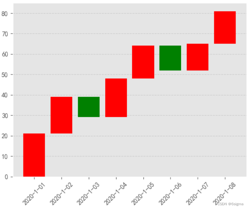
# 14 : 玫瑰图
# create 样本数据
name = list('ABCDEFGHIJKLMNOPQRST')
amount = [805,892,773,744,692,623,605,598,586,585,575,573,562,500,494,469,396,373,357,323]
df1 = pd.DataFrame({'name':name,'amount':amount})
# 数据重新排序后必须重置索引,否则下面的数据拼接就会出错,因为基于的是index
df = df1.sort_values('amount',ascending=False).reset_index()


angle =np.linspace(0,2*np.pi,len(df.amount),endpoint=False)
fig=plt.axes(polar=True) # 实例化极坐标系
# 图.set_theta_direction(-1) # 顺时针为极坐标正方向
fig.set_theta_zero_location('N') # 让0度指向N
color =['b','gold','darkviolet','turquoise','r','g','grey','c','m','y','k','darkorange','lightgreen','plum','tan']

# 因为图形需要首位相连,所以需要对数据进行处理
amount = np.concatenate((df.amount,[df.amount[0]]))
angle = np.concatenate((angle,[angle[0]]))
name = np.concatenate((df.name,[df.name[0]]))
plt.bar(angle,amount,width=0.33,color=color)
plt.bar(x=angle, height=130, width=0.33, color='white')  # 挖孔
# 数据标签
for angle, amount, name in zip(angle, amount, name):
    plt.text(angle+0.03, amount+100, str(name) )
plt.gca().set_axis_off() # 不显示坐标轴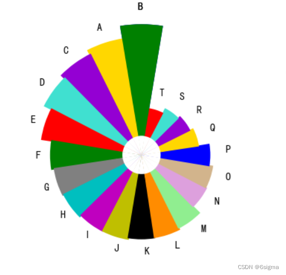
# 添加辅助线及填充
plt.axhline(y=0.2,linewidth = 2, c='g')
plt.axvline(x=0.2,linewidth = 2, c='g')

# 画线段
plt.axhline(y=0.5,xmin=0.2,xmax=0.7,linewidth = 2, c='r')

# 在指定位置填充,1,1.3 分别代表y轴坐标
plt.axhspan(1,1.3,facecolor='g')
# 在指定位置填充,1,1.3 分别代表x轴坐标
plt.axvspan(2,2.3,facecolor='r',alpha=0.3)


# 例子:添加平均线及文本注释
plt.bar(df_pivot.销售时间, df_pivot.拒货,label='拒货',facecolor='g')

# add 平均线
mean_num = np.mean(df_pivot.拒货)
plt.axhline(y=mean_num,color='r', linestyle=':') # linestyle 用来设置线形

# 添加文本注释
# para:xy:用来指定x,y轴的位置
# shrink: 箭头的长度
# arrowprops: 设置箭头的颜色,样式大小等
plt.annotate("均值线",xy=(9,mean_num+5),arrowprops=dict(facecolor='r', shrink=0.05,headlength=100, width=5, headwidth=10,edgecolor='green',linestyle='--',linewidth=1))
常用的标记marker:

文章来源:https://blog.csdn.net/weixin_42224930/article/details/135221575
本文来自互联网用户投稿,该文观点仅代表作者本人,不代表本站立场。本站仅提供信息存储空间服务,不拥有所有权,不承担相关法律责任。 如若内容造成侵权/违法违规/事实不符,请联系我的编程经验分享网邮箱:veading@qq.com进行投诉反馈,一经查实,立即删除!
本文来自互联网用户投稿,该文观点仅代表作者本人,不代表本站立场。本站仅提供信息存储空间服务,不拥有所有权,不承担相关法律责任。 如若内容造成侵权/违法违规/事实不符,请联系我的编程经验分享网邮箱:veading@qq.com进行投诉反馈,一经查实,立即删除!