html旋转相册
2023-12-23 17:49:32
一、实验题目
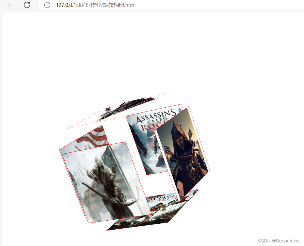
做一个旋转的3d相册
二、实验代码
<!DOCTYPE html>
<html lang="zh">
	<head>
		<meta charset="UTF-8">
		<meta http-equiv="X-UA-Compatible" content="IE=edge">
		<meta name="viewport" content="width=device-width, initial-scale=1.0">
		<title>Document</title>
		<style>
			body{
				perspective: 1500px;
			}
			@keyframes myAnimation {
				from{
					transform: rotateX(0deg) rotateY(0deg) rotateZ(0deg);
				}
				to{
					transform: rotateX(360deg) rotateY(360deg) rotateZ(360deg);
				}
			}

			.container{
				margin:200px;
				position: relative;
				transform-style: preserve-3d;
				/* animation:myAnimation 5s linear 0s infinite; */
				animation-name: myAnimation;
				animation-duration: 5s;
				animation-timing-function: linear;
				animation-delay: 0s;
				animation-iteration-count: infinite;

			}

			/* .container:hover{
				transform: rotateX(45deg) rotatey(45deg) rotateZ(45deg);
			} */
			.container:hover>img:first-child{
				left: -300px;
			}
			.container:hover>img:nth-child(2){
				top: -300px;
			}
			.container:hover>img:nth-child(3){
				left: 300px;
			}
			.container:hover>img:nth-child(4){
				top: 300px;
			}
			.container:hover>img:nth-child(6){
				transform: translateZ(300px);
			}
			.container:hover>img:nth-child(5){
				transform: translateZ(-100px);
			}
			.container>img{
				width: 200px;
				height: 200px;
				position: absolute;
				border: 1px solid red;
				transition: 3s;
			}
			.container>img:first-child{
				left: -200px;
				transform-origin: right;
				transform: rotateY(90deg);
			}
			.container>img:nth-child(2){
				top:-200px;
				transform-origin: bottom;
				transform:rotateX(-90deg);
			}
			.container>img:nth-child(3){
				left: 200px;
				transform-origin: left;
				transform:rotateY(-90deg)
			}
			.container>img:nth-child(4){
				top: 200px;
				transform-origin: top;
				transform: rotateX(90deg);
			}
			.container>img:nth-child(6){
				transform: translateZ(200px);
			}
		</style>
	</head>
	<body>
		<div class="container">
			<img src="https://img1.baidu.com/it/u=4141189809,1768157998&fm=253&fmt=auto&app=138&f=JPEG?w=667&h=500" alt="">
			<img src="https://img0.baidu.com/it/u=2016271455,67708748&fm=253&fmt=auto&app=138&f=PNG?w=500&h=402" alt="">
			<img src="https://img2.baidu.com/it/u=2015943875,2629908785&fm=253&fmt=auto&app=138&f=JPEG?w=500&h=666" alt="">
			<img src="https://img2.baidu.com/it/u=106832573,1691962947&fm=253&fmt=auto&app=138&f=JPEG?w=500&h=682" alt="">
			<img src="https://img0.baidu.com/it/u=2104936347,2912513001&fm=253&fmt=auto&app=138&f=JPEG?w=389&h=500" alt="">
			<img src="https://img1.baidu.com/it/u=1599285144,422526079&fm=253&fmt=auto&app=138&f=JPEG?w=500&h=375" alt="">
		</div>
	</body>
</html>
三、实验效果
文章来源:https://blog.csdn.net/2301_80177550/article/details/135171287
本文来自互联网用户投稿,该文观点仅代表作者本人,不代表本站立场。本站仅提供信息存储空间服务,不拥有所有权,不承担相关法律责任。 如若内容造成侵权/违法违规/事实不符,请联系我的编程经验分享网邮箱:veading@qq.com进行投诉反馈,一经查实,立即删除!
本文来自互联网用户投稿,该文观点仅代表作者本人,不代表本站立场。本站仅提供信息存储空间服务,不拥有所有权,不承担相关法律责任。 如若内容造成侵权/违法违规/事实不符,请联系我的编程经验分享网邮箱:veading@qq.com进行投诉反馈,一经查实,立即删除!